September 7, 2026

Atique Hasan
The decision stage of the buying journey is where product landing page UX gets to shine. Visitors arrive with their wallets half-open. They've read the specs and compared a few other options.
Now, they need proof, price, and a path. So, we ditch the storytelling. We put the "Start Now" button above the fold, list use cases next to the features, and let screenshots do the selling.
Every section must tell customers why they should act now. If it doesn't, we delete it. That's the whole discipline.
Here's the system we use.
Most landing pages answer that question with adjectives. Yours should answer it with evidence.
Visitors at the decision stage don't need persuasion copy. They want confirmation from people who have already bought.
Northwestern University's Spiegel Research Center found that purchase likelihood for a product displaying five reviews is 270% higher than for the same product with none, and that the effect is strongest on higher-priced, higher-consideration purchases. That study measured retail reviews rather than B2B testimonials, but the mechanism carries over: at the decision stage, a small number of specific, attributable proof points move buyers further than any volume of persuasion copy.
To implement this:
A company that's a great example of how to do this is Superhuman, a productivity suite that combines email, collaborative documents, writing assistance, and an AI assistant in one ecosystem.
Their product landing page for their Docs feature builds decision-stage trust through structure. It breaks Docs into discrete use cases, including collaborative docs, project management, knowledge hubs, and workflows. Each use case gets its own screenshot.
Social proof appears in layers. A logo bar gives instant credibility, then excerpts from customer stories name specific roles and companies. Descriptions for product, marketing, sales, and operations let visitors identify their role and see relevant functionality without wading through unrelated features.
This structure answers the section's question before visitors scroll past the screenshots. It gives them a faster route to confidence. The result is a page that supports evaluation with evidence, context, and clear relevance.
Once a visitor decides your product fits their needs, a new question takes over. Which version do they actually need?
Too many options create hesitation instead of confidence. Too few feel restrictive.
The pricing section on your landing page needs to answer this fast, or visitors will bounce to compare elsewhere.
To help them decide:
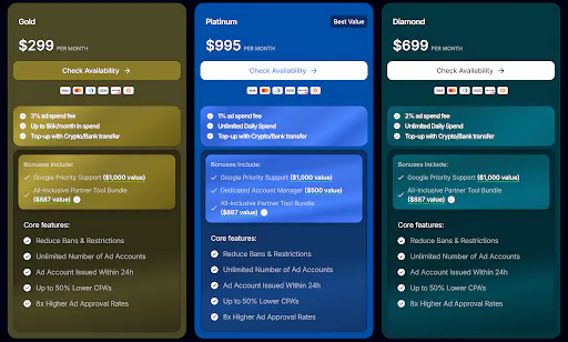
Uproas, which offers premium agency ad accounts for services like TikTok, Meta, and Google, handles this clearly on its Google agency ad accounts rental page.
The page splits its offer into Gold, Platinum, and Diamond tiers, each with its own visible pricing, spending allowances, and fee structure. Features and availability differences sit right below the price, so buyers can compare without hunting through separate pages or FAQs. Every tier includes its own action button, so a visitor ready for Platinum never has to second-guess which link applies to them.
This structure turns a potentially confusing decision- choosing between three similar plans- into a quick comparison that respects the buyer's time and gets them moving toward checkout.
A visitor who gets to this point believes your product may be suitable for their needs. They don't require further persuasion. They just need a way to proceed without making a major commitment.
Providing a free trial or a demo booking allows hesitant buyers to evaluate the product instead of asking for an immediate purchase.
This works because it lowers the stakes. Someone who isn't ready to buy might still be ready to try, and that smaller step often leads straight to the bigger one once they see real value.
To achieve this:
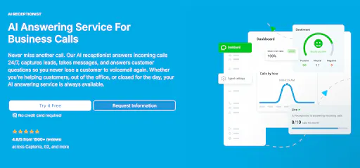
DialMyCalls, a mass text messaging service that also offers automated call handling, applies this on the landing page for its AI answering service for business calls.
Right in the hero section, after presenting its value proposition, the page shows two CTAs side by side. One is to try the service for free, and the other is to request a demo. Visitors who want to jump in immediately can, and visitors who want a guided walkthrough can choose that instead.
Neither path competes with the other, and neither gets buried below the fold.
Decision-stage visitors don't need more persuasion. They just deserve less friction between "I'm interested" and "I'm in."
So, audit your product landing pages against these three questions:
Fix what's missing, then track where visitors actually click. That data will tell you more about your page than any best-practices list ever could.
If you're starting from a blank page rather than fixing an existing one, our roundups of SaaS landing page templates and WordPress themes for SaaS and landing pages cover layouts that already ship with the pricing, testimonial, and CTA sections described above. For early-stage teams building their first conversion-focused site, our guide to web design for startups is a useful companion piece..
The decision stage is the point where a visitor has already understood the problem and compared the available options and is choosing whether to buy from you specifically. Landing page UX at this stage should prioritise proof, pricing clarity, and an obvious next step over education or storytelling.
An awareness-stage page explains a problem and builds interest. A decision-stage page assumes the visitor already knows the problem and instead removes doubt. That means less narrative copy, more screenshots, named social proof, transparent pricing, and a CTA that is visible above the fold.
There is no fixed number, but research on reviews suggests the largest gains come from the first few pieces of credible proof, with diminishing returns after that. Prioritise attributable quotes that name a person, role, and outcome, and group them by job function so visitors can find the one that matches them.
For self-serve and mid-market products, showing pricing almost always performs better at the decision stage, because a hidden price sends the visitor to a competitor or a review site to find it. If your pricing is genuinely bespoke, publish a starting price or a range and explain what drives the final number.
Only if you need it. Requiring a card raises trial quality but reduces trial volume, so the right answer depends on whether your bottleneck is lead count or lead quality. If you do require one, say so plainly on the button or directly beneath it, so the requirement is never a surprise mid-signup.
Making the visitor work out which action applies to them. One generic CTA for three pricing tiers, an unlabelled "Get started" button, or a signup form with ten fields all add a decision the visitor did not ask to make, and each one costs conversions.