November 30, 2025
Animating Components in Nuxt with VueUse Motion

Md. Saad
Looking for a clean, performant way to add animations to your Nuxt 3 application without writing complex CSS or managing custom animation logic? VueUse Motion provides a developer-friendly, composable-based API that integrates seamlessly with Nuxt and the VueUse ecosystem. It allows you to animate components using simple directives, presets, and programmatic controls while keeping your codebase maintainable and efficient.
In this tutorial, you’ll learn how to install VueUse Motion, configure it correctly in a Nuxt project, and implement common animation patterns such as enter transitions, scroll-based effects, and staggered lists using practical, real-world examples.
What Is VueUse Motion?
VueUse Motion is a lightweight animation library built on top of the popular VueUse ecosystem. It provides:
Easy-to-use animation composables
- Motion directives like v-motion
- Enter/leave transitions
- Scroll-based animations
- Preconfigured animations (fade, pop, slide, scale, etc.)
It’s a perfect fit for Nuxt 3 developers who want smooth UI interactions—without writing complex CSS or building custom animation logic.
Step 1: Install VueUse Motion in Your Nuxt 3 Project
Inside your Nuxt project, install the package:
npm install @vueuse/motionNuxt auto-imports most composables, but we still need to register the plugin manually.
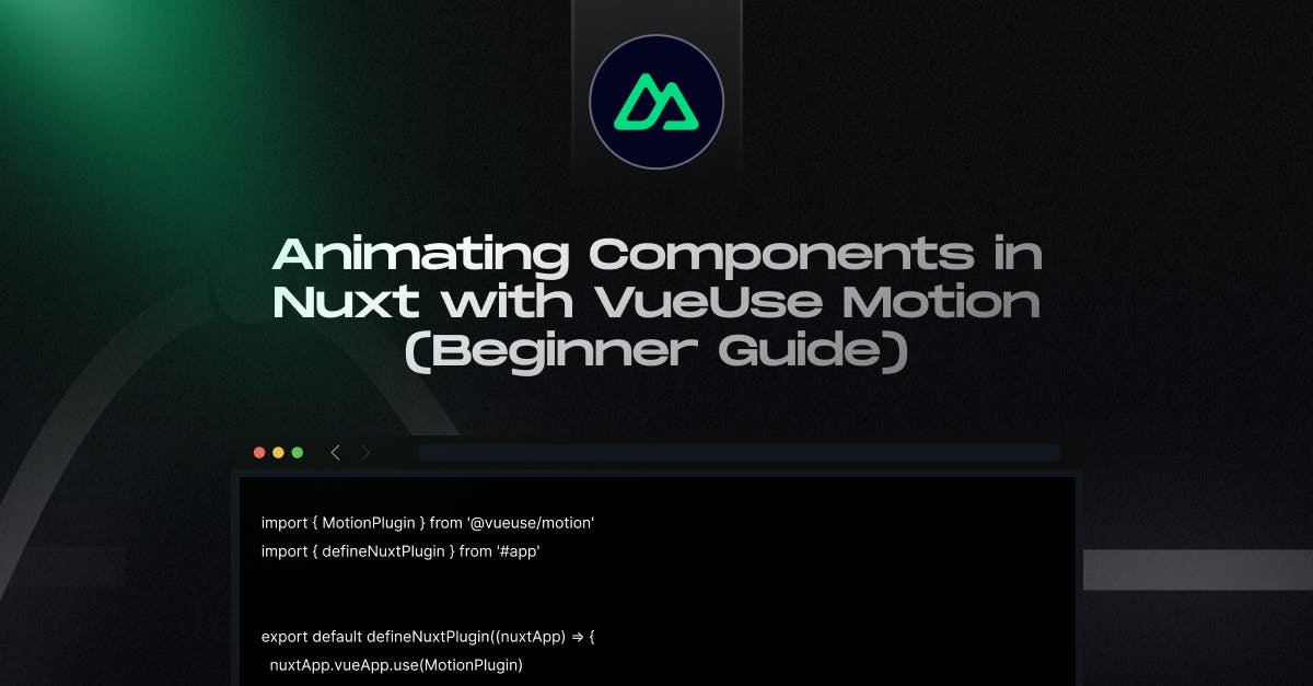
Step 2: Create a Motion Plugin for Nuxt
Create your plugin file: plugins/motion.client.ts
import { MotionPlugin } from '@vueuse/motion'
import { defineNuxtPlugin } from '#app'
export default defineNuxtPlugin((nuxtApp) => {
nuxtApp.vueApp.use(MotionPlugin)
})Why .client.ts?
Animations are primarily browser-based and do not run on the server.
Step 3: Animate Your First Component with v-motion
Let’s animate a simple card component.
Example: Fade & Slide in on Mount
<template>
<div
v-motion
:initial="{ opacity: 0, y: 50 }"
:enter="{ opacity: 1, y: 0 }"
class="p-6 max-w-sm rounded-xl bg-white shadow"
>
<h2 class="text-xl font-semibold">Hello Motion!</h2>
<p class="text-gray-600">Nuxt + VueUse Motion = smooth animations.</p>
</div>
</template> What happens?
The card smoothly fades in and slides up when it enters the viewport.
Step 4: Using Motion Presets (Even Simpler)
VueUse Motion includes animated presets, so you don’t have to define your own transitions every time.
Example: Using the Built-In fadeIn Preset
<template>
<div v-motion-fade class="p-6 bg-green-200 rounded-lg">
This uses the fade preset.
</div>
</template>Other presets include:
- v-motion-pop
- v-motion-slide-left
- v-motion-slide-right
- v-motion-slide-up
- v-motion-slide-down
Step 5: Animate on Scroll (Scroll-Based Motion)
Want elements to animate when they appear on screen?
VueUse Motion includes intersection-based triggers built-in.
Example: Scroll Fade-In
<template>
<section class="space-y-10">
<div
v-motion
:initial="{ opacity: 0, y: 60 }"
:visible="{ opacity: 1, y: 0 }"
class="p-6 bg-blue-200 rounded-lg"
>
I animate when scrolled into view!
</div>
</section>
</template>- visible is triggered when the element becomes visible.
Step 6: Grouped or Staggered Animations
Animate lists with a natural, delayed sequence.
Example: Staggered Card Animation
<script setup>
const items = ['One', 'Two', 'Three']
</script>
<template>
<div class="space-y-4">
<div
v-for="(item, i) in items"
:key="i"
v-motion
:initial="{ opacity: 0, y: 40 }"
:enter="{ opacity: 1, y: 0, transition: { delay: i * 0.2 } }"
class="p-4 bg-white shadow rounded-lg"
>
{{ item }}
</div>
</div>
</template>Each item appears with a slight delay — clean and professional.
Step 7: Programmatic Animation with useMotion
If you need more power, use useMotion() to animate via composables.
Example:
<script setup>
import { useMotion } from '@vueuse/motion'
const box = ref(null)
const { apply } = useMotion(box, {
initial: { scale: 1 },
hovered: { scale: 1.1 },
})
</script>
<template>
<div
ref="box"
@mouseenter="apply('hovered')"
@mouseleave="apply('initial')"
class="w-32 h-32 bg-red-300 rounded-lg transition-all"
/>
</template>Great for interactive UI elements like buttons and cards.
Best Practices for Motion in Nuxt
- Use .client.ts when registering animation plugins
- Avoid overuse
- Use presets for consistency
- Combine with Tailwind for styling
- Test performance on mobile devices
Conclusion
VueUse Motion proves that adding high-quality animations to Nuxt 3 does not have to come at the expense of performance, maintainability, or developer experience. With its composable-first approach, built-in presets, and seamless Nuxt integration, you can implement meaningful motion patterns that enhance usability without bloating your codebase. From simple enter transitions to scroll-based and interactive animations, VueUse Motion scales with your project as complexity grows.
If you’re planning a Nuxt project and want animations that feel intentional, performant, and production-ready, working with the right team makes all the difference. At StaticMania, we help teams design and build Nuxt applications with clean architecture, optimized motion systems, and long-term scalability in mind.
Contact us today to turn your UI ideas into polished, high-performing experiences that users love to interact with.
Frequently Asked Questions
VueUse Motion is a lightweight animation library built for Vue and Nuxt that provides composables and directives for creating smooth UI animations. It integrates cleanly with Nuxt 3 and allows developers to add motion without complex CSS or heavy JavaScript logic.
VueUse Motion is better for state-driven, interactive, and scroll-based animations. CSS animations are ideal for simple transitions, but VueUse Motion offers more control, reactivity, and consistency when animations depend on user interaction or component lifecycle.
When used correctly, VueUse Motion has minimal performance impact. It relies on efficient browser APIs and works well with Nuxt’s rendering model. Avoid overusing animations and test on mobile devices to maintain strong Core Web Vitals scores.
Yes. VueUse Motion works with Nuxt 3 when registered as a client-side plugin using .client.ts. Animations run only in the browser, ensuring compatibility with SSR and preventing hydration issues.
You can use the visible state with v-motion to trigger animations when elements enter the viewport. VueUse Motion handles intersection detection internally, making scroll animations simple and reliable without extra libraries.
Use presets like v-motion-fade or v-motion-slide-up for consistent, quick animations. Choose programmatic animations with useMotion() when you need interactive states, dynamic timing, or complex user-driven behavior.