September 1, 2025
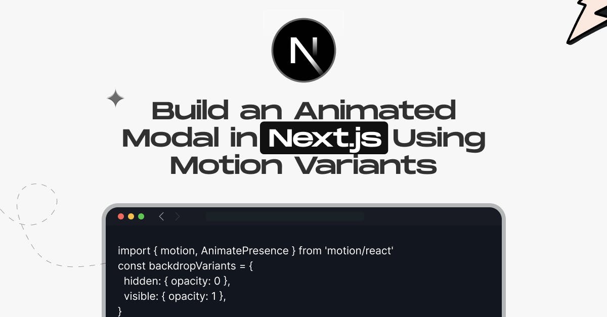
Build an Animated Modal in Next.js Using Motion Variants

Md. Saad
TL;DR
Building an animated modal in Next.js becomes simple and engaging with Motion Variants from Framer Motion. Instead of static pop-ups, you can create smooth entrance and exit transitions, fade-in backdrops, and responsive interactions. The reusable <Modal /> component leverages AnimatePresence for seamless mounting and unmounting, while React’s useState hook controls visibility. Users can open the modal with a button and close it by clicking outside the content or pressing a close button. With Motion Variants, animations remain lightweight and accessible, utilizing transforms such as opacity, scale, and slide effects for improved performance. Combined with Tailwind CSS, this setup ensures a responsive design and a polished user experience. Perfect for login forms, alerts, or previews, this method helps you build professional, interactive modals that enhance usability in modern Next.js apps.
Introduction
Modals are ubiquitous, appearing in various contexts, including login forms, signup prompts, product previews, and notifications. But a static modal often feels clunky and outdated. In modern web apps, users expect smooth, engaging experiences, and that’s where animated modals in Next.js with Motion Variants shine. With Motion.dev (the updated version of Framer Motion), you can create dynamic modals that fade, slide, and close gracefully, while maintaining your UI's responsiveness and user-friendliness. In this tutorial, you’ll learn step by step how to build a reusable animated <Modal /> component in Next.js using state, motion variants, and Tailwind CSS for a sleek design.
What You’ll Learn
- The process of creating a reusable <Modal /> component having variations
- How to animate the modal entrance/exit and backdrop
- How to use React state to toggle modal visibility
- How to click outside the content to close the modal
Prerequisites
Step 1: Create the Modal Component
The first step in creating the Modal component is to add it to the /components/Modal.jsx file. To manage fluid animations when the modal mounts and unmounts, use Framer Motion's AnimatePresence. To control a basic fade-in and fade-out effect for the background overlay, define a variant and name it backdropVariants. This will make the backdrop appear and disappear nicely. Next, add a soft slide-and-fade animation to modalVariants to give the modal box itself a dynamic and smooth entrance and exit. Configure the logic so that clicking inside the modal will stop the click event from bubbling up and prevent accidental closures, and clicking outside the modal content will cause the modal to be closed by the onClose function. This will improve the modal's usability. To keep things simple, you don't need to add any scroll-lock functionality to this entry-level version. You can make a modal component that is both visually appealing and interactive by following these guidelines.
'use client'
import { motion, AnimatePresence } from 'motion/react'
const backdropVariants = {
hidden: { opacity: 0 },
visible: { opacity: 1 },
}
const modalVariants = {
hidden: { y: -30, opacity: 0 },
visible: {
y: 0,
opacity: 1,
transition: {
type: 'spring',
damping: 20,
stiffness: 300,
},
},
}
export default function Modal({ isOpen, onClose, children }) {
return (
<AnimatePresence>
{isOpen && (
<motion.div
className="fixed inset-0 z-50 flex items-center justify-center bg-black/50"
variants={backdropVariants}
initial="hidden"
animate="visible"
exit="hidden"
onClick={onClose}
>
<motion.div
className="bg-white p-6 rounded-xl shadow-xl w-full max-w-md mx-4 dark:bg-neutral-900"
variants={modalVariants}
initial="hidden"
animate="visible"
exit="hidden"
onClick={(e) => e.stopPropagation()}
role="dialog"
aria-modal="true"
>
{children}
</motion.div>
</motion.div>
)}
</AnimatePresence>
)
}Step 2: Use the Modal in a Page
Next, to use the Modal component in a page, edit the file /app/page.jsx. At the top, add 'use client' since you’ll be using React state. Import useState from React and your Modal component. Inside your functional component, create a piece of state called isOpen to track whether the modal is visible. Initially, set the isOpen state value to false so that the modal is hidden. Then, in your JSX, add a button that sets isOpen to true when clicked, opening the modal. Render the Modal component with the isOpen and onClose props, passing a function to close the modal by setting isOpen to false. Inside the modal, you can place any content you want—for example, a heading, some text, and a close button that also sets isOpen to false. This setup lets you control the modal’s visibility using React state while enjoying the animated transitions provided by your modal component.
'use client'
import { useState } from 'react'
import Modal from '@/components/Modal'
export default function Home() {
const [isOpen, setIsOpen] = useState(false)
return (
<main className="min-h-screen flex flex-col items-center justify-center">
<button
onClick={() => setIsOpen(true)}
className="px-4 py-2 bg-blue-600 text-white rounded-lg"
>
Open Modal
</button>
<Modal isOpen={isOpen} onClose={() => setIsOpen(false)}>
<h2 className="text-xl font-bold mb-4">Hello Modal</h2>
<p>This modal uses motion variants and React state for animations.</p>
<button
onClick={() => setIsOpen(false)}
className="mt-4 px-4 py-2 bg-red-500 text-white rounded-lg"
>
Close
</button>
</Modal>
</main>
)
}Conclusion
Building an animated modal in Next.js using Motion Variants transforms a simple UI element into an engaging, interactive experience. By combining React state management, Motion’s powerful animation system, and clean Tailwind CSS styling, you can deliver modals that not only look great but also enhance usability with smooth entrances, exits, and intuitive click-to-close interactions.
At StaticMania, our team of JavaScript and Next.js experts specializes in creating modern, performance-driven web applications with polished user experiences. Whether it’s animated modals, complex page transitions, or full-scale UI design systems, we ensure your website feels fast, interactive, and future-ready. Ready to elevate your Next.js project? Let StaticMania help you bring ideas to life with precision and creativity. Book a Call today
FAQs: Animated Modal in Next.js Using Motion Variants
You can create an animated modal in Next.js using Framer Motion’s Motion Variants. Build a reusable <Modal /> component, apply AnimatePresence for entrance and exit transitions, and use useState to toggle visibility.
Motion Variants provide more control than CSS, allowing smooth entrance/exit transitions, backdrop animations, and state-driven effects. They integrate seamlessly with React and Next.js, making them ideal for dynamic modals.
Yes. In your <Modal /> component, add an onClick handler to the backdrop that triggers the onClose function. Use e.stopPropagation() on the modal content to prevent accidental closures.
Yes, if implemented correctly. Always include role="dialog" and aria-modal="true" attributes for accessibility. Pairing Motion with semantic HTML ensures modals are screen-reader-friendly.
Keep animations lightweight by using transforms like opacity, scale, and translate. Use AnimatePresence for conditional rendering and avoid heavy DOM reflows. Tailwind CSS can help optimize styling.
Absolutely. Create a reusable modal component and pass content as children props. This allows you to use one animated modal pattern throughout your app with different content inside.