March 23, 2025
Getting Started with Tailwind CSS: A Complete Setup Guide for Your First Project

Md. Saad
Tailwind CSS is a utility-first CSS framework that enables you to build modern, responsive user interfaces quickly. Unlike traditional CSS frameworks that provide predefined components, Tailwind offers low-level utility classes that let you style elements directly in your HTML.
🌟 Key Features of Tailwind CSS:
- Utility-First Approach: Style elements using small, reusable classes like p-4, text-center, or bg-blue-500 without writing custom CSS.
- Responsive Design Made Easy: Use responsive variants like sm:, md:, lg: directly in your classes.
- Dark Mode Support: Easily implement dark mode styling with built-in support.
- JIT (Just-In-Time) Compiler: Generates only the classes you use, improving build times and reducing CSS file sizes.
Setting Up Tailwind CSS V4
1. Initialize Your Project
Create a new project folder and initialize it with npm:
mkdir my-tailwind-project
cd my-tailwind-project
npm init -y2. Install Tailwind CSS and Dependencies
npm install tailwindcss @tailwindcss/postcss postcssThis command creates all the necessary files.
3. Add postcss.config.mjs
Create a postcss.config.mjs file at the root of the project. Now add the following codes:
export default {
plugins: {
"@tailwindcss/postcss": {},
}
}4. Update package.json
Add these scripts to your package.json:
"scripts": {
"dev": "npx @tailwindcss/cli -i ./styles/input.css -o ./dist/output.css --watch",
"build": "npx @tailwindcss/cli -i ./styles/input.css -o ./dist/output.css --minify"
},- npm run dev: Watches for changes in development mode.
- npm run build: Generates minified production CSS.
Your final package.json file should be like this:
{
"scripts": {
"dev": "npx @tailwindcss/cli -i ./styles/input.css -o ./dist/output.css --watch",
"build": "npx @tailwindcss/cli -i ./styles/input.css -o ./dist/output.css --minify"
},
"dependencies": {
"@tailwindcss/postcss": "^4.0.7",
"postcss": "^8.5.3",
"tailwindcss": "^4.0.7"
}
}Customizing Tailwind CSS Styles using
Tailwind provides a flexible way to customize your design system. Often the biggest challenge when working with a framework is figuring out what to do when you need something the framework doesn’t handle out of the box. Tailwind CSS is designed to be extensible and customizable, so no matter what you’re building, you won’t feel like you’re fighting the framework.
This guide covers how to customize design tokens, break out constraints when necessary, add custom CSS, and extend Tailwind with plugins.
1. Customizing the Theme
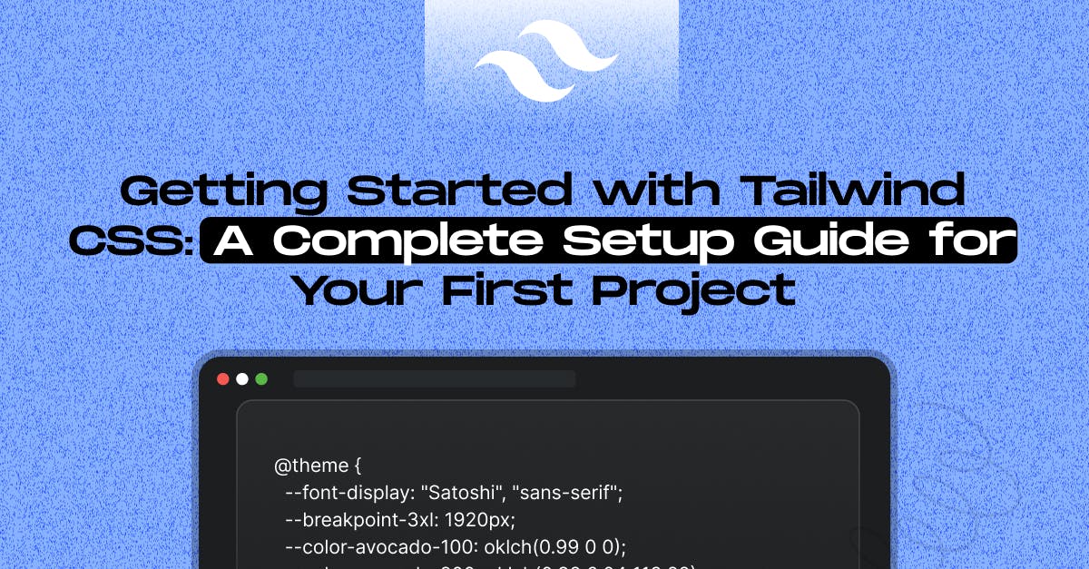
To change your color palette, spacing scale, typography scale, or breakpoints, use the @theme directive in your CSS:
@theme {
--font-display: "Satoshi", "sans-serif";
--breakpoint-3xl: 1920px;
--color-avocado-100: oklch(0.99 0 0);
--color-avocado-200: oklch(0.98 0.04 113.22);
--color-avocado-300: oklch(0.94 0.11 115.03);
--color-avocado-400: oklch(0.92 0.19 114.08);
--color-avocado-500: oklch(0.84 0.18 117.33);
--color-avocado-600: oklch(0.53 0.12 118.34);
--ease-fluid: cubic-bezier(0.3, 0, 0, 1);
--ease-snappy: cubic-bezier(0.2, 0, 0, 1);
}Use in HTML:
<h1 class="font-display ">Hello, Tailwind with Custom Styles!</h1>
<button class="btn mt-4">Custom Button</button>2. Customizing Utilities
Utilities are single-purpose classes (e.g., text-center, bg-red-500). You can create custom ones to extend Tailwind’s built-in set. Override default utilities using the @layer utilities directive.
Adding Custom Utilities:
@layer utilities {
.text-shadow {
text-shadow: 2px 2px 5px rgba(0, 0, 0, 0.3);
}
.skew-10 {
transform: skewY(-10deg);
}
}HTML usage:
<p class="text-shadow">This text has a shadow.</p>
<div class="skew-10 bg-gray-200 p-4">Skewed Box</div>✅ Use utilities for quick, reusable tweaks without writing custom CSS every time.
3. Creating Reusable Components
Components are reusable blocks of styles (e.g., cards, buttons) that encapsulate more complex styling. Create custom components using the @layer components directive.
Adding Custom Components
@layer components {
.btn-primary {
@apply px-4 py-2 rounded font-semibold text-white bg-primary hover:bg-indigo-700;
}
.card {
@apply p-6 rounded-lg shadow-md bg-white border border-gray-200;
}
}✅ Use components to avoid duplicating common UI elements.
HTML usage:
<button class="btn-primary">Primary Button</button>
<div class="card mt-4">
<h2 class="text-lg font-bold">Card Title</h2>
<p>This is a reusable card component.</p>
</div>4. Customizing Base Styles
Base styles provide global element resets and base typography. Override default styles using the @layer base directive.
Adding Base Styles
@layer base {
h1 {
@apply text-4xl font-bold;
}
a {
@apply text-primary underline;
}
}HTML usage:
<h1 class="font-inter">Hello, Tailwind with Custom Styles!</h1>
<a href="#">Styled Link</a>✅ Base styles ensure a consistent foundation across your project.
5. Using Arbitrary Values
While most designs can be built with predefined tokens, sometimes you need precise adjustments. Use Tailwind’s square bracket notation to add arbitrary values:
<div class="top-[117px] lg:top-[344px]">...</div>This works for colors, font sizes, pseudo-element content, and more:
<div class="bg-[#bada55] text-[22px] before:content-['Festivus']">...</div>
<div class="fill-(--my-brand-color)">...</div>Referencing CSS variables is straightforward, with Tailwind automatically adding var() for you.
6. Arbitrary Properties
If Tailwind doesn’t have a utility for a CSS property you need, use square brackets:
<div class="[mask-type:luminance] hover:[mask-type:alpha]">...</div>This allows for responsive and interactive modifications, even with custom properties:
<div class="[--scroll-offset:56px] lg:[--scroll-offset:44px]">...</div>7. Arbitrary Variants
Arbitrary variants let you modify selectors on the fly:
<ul role="list">
<li class="lg:[&:nth-child(-n+3)]:hover:underline">Item 1</li>
<li class="lg:[&:nth-child(-n+3)]:hover:underline">Item 2</li>
</ul>8. Handling Whitespace
When an arbitrary value contains spaces, use underscores (_), which Tailwind converts to spaces at build-time:
<div class="grid grid-cols-[1fr_500px_2fr]">...</div>For URLs or cases where spaces are invalid, underscores remain as is:
<div class="bg-[url('/what_a_rush.png')]">...</div>To use an actual underscore when it might be ambiguous, escape it:
<div class="before:content-['hello\_world']">...</div>In JSX, use String.raw() to prevent escape character issues:
<div className={String.raw`before:content-['hello\_world']`}>...</div>9. Resolving Ambiguities
Many Tailwind utilities share a namespace (e.g., text-lg for font-size, text-black for color). Tailwind usually resolves ambiguities automatically.
<div class="text-[22px]">Font size 22px</div>
<div class="text-[#bada55]">Text color</div>For CSS variables, add a data type hint to clarify:
<div class="text-(length:--my-var)">Font Size</div>
<div class="text-(color:--my-var)">Color</div>10 Adding Custom Utilities
To add custom utilities, use the @utility directive:
@utility content-auto {
content-visibility: auto;
}Use functional utilities to accept arguments:
@theme {
--tab-size-2: 2;
--tab-size-4: 4;
}@utility tab-* {
tab-size: --value(--tab-size-*, integer, [integer]);
}This allows usage like tab-2, tab-4, or tab-[8].
11. Supporting Negative Values
Register positive and negative utilities separately:
@utility inset-* {
inset: calc(var(--spacing) * --value([percentage], [length]));
}@utility -inset-* {
inset: calc(var(--spacing) --value([percentage], [length]) -1);
}12. Adding Custom Variants
Use the @variant directive for state-based styles:
.my-element {
background: white;
@variant dark { background: black; }
@variant hover { background: gray; }
}Project Setup with Tailwind CSS v3 and Sass
Tailwind also provides support for its older version. Users can choose either version of V4 or V3 to their liking. Let’s discuss how we can use Tailwind CSS v3 and SASS.
1. Initialize Your Project
mkdir my-tailwind-project
cd my-tailwind-project
npm init -y2. Install Dependencies
npm install -D tailwindcss@3 postcss autoprefixer sass concurrently
npx tailwindcss initThis creates:
- tailwind.config.js: Tailwind configuration file
- postcss.config.js: PostCSS configuration file
3. Configure Tailwind to Scan Files
Update tailwind.config.js:
/** @type {import('tailwindcss').Config} */
module.exports = {
content: ["./index.html", "./src/**/*.{js,ts,jsx,tsx,scss}"],
theme: {
extend: {
colors: {
primary: "#4f46e5",
secondary: "#10b981",
},
fontFamily: {
inter: ["Inter", "sans-serif"],
},
},
},
plugins: [],
};🎨 Setting Up Sass and Development Scripts
1. Create Sass File
Create a styles/ folder and add styles.scss:
@tailwind base;
@tailwind components;
@tailwind utilities;
// Custom Sass variables and styles
$primary-color: #4f46e5;
.btn {
@apply px-4 py-2 rounded text-white;
background-color: $primary-color;
}
@layer components {
.card {
@apply p-6 rounded-lg shadow-md bg-white;
}
}
@layer utilities {
.text-shadow {
text-shadow: 2px 2px 5px rgba(0, 0, 0, 0.3);
}
}
@layer base {
h1 {
@apply text-4xl font-bold;
}
a {
@apply text-primary underline;
}
}2. Update package.json Scripts
{
"scripts": {
"dev": "concurrently \"sass --watch styles/styles.scss:dist/pre-tailwind.css\" \"tailwindcss -i dist/pre-tailwind.css -o dist/output.css --watch\"",
"build": "sass styles/styles.scss:dist/pre-tailwind.css && tailwindcss -i dist/pre-tailwind.css -o dist/output.css --minify"
},
"devDependencies": {
"autoprefixer": "^10.0.0",
"concurrently": "^8.0.0",
"postcss": "^8.0.0",
"sass": "^1.60.0",
"tailwindcss": "^3.4.17"
}
}✅ Key Points:
- Cross-platform compatible commands.
- Instant rebuilds when files change.
Customizing Styles with Tailwind’s Layers
Tailwind allows customization through three layers: Utilities, Components, and Base Styles.
1. Custom Utilities
Add reusable utility classes in styles.scss:
@layer utilities {
.text-shadow {
text-shadow: 2px 2px 5px rgba(0, 0, 0, 0.3);
}
.skew-10 {
transform: skewY(-10deg);
}
}Usage:
<p class="text-shadow">Text with shadow effect</p>
<div class="skew-10 bg-gray-200 p-4">Skewed Box</div>2. Reusable Components
Define components for consistent UI elements:
@layer components {
.btn-primary {
@apply px-4 py-2 rounded font-semibold text-white bg-primary hover:bg-indigo-700;
}
.card {
@apply p-6 rounded-lg shadow-md bg-white border border-gray-200;
}
}Usage:
<button class="btn-primary">Primary Button</button>
<div class="card mt-4">Reusable Card Component</div>3. Global Base Styles
Set foundational styles for consistent design:
@layer base {
h1, h2, h3, h4, h5, h6 {
@apply font-sans font-bold text-gray-900;
}
a {
@apply text-primary underline hover:text-indigo-700;
}
body {
@apply bg-gray-50 text-gray-800 leading-relaxed;
}
}Usage:
<h1>Styled Heading</h1>
<a href="#">Styled Link</a>Creating and Viewing Your Project
Finally, for both Tailwind V4 and V3 we can use this final HTML sample.
HTML Example:
<!DOCTYPE html>
<html lang="en">
<head>
<meta charset="UTF-8" />
<meta
name="viewport"
content="width=device-width, initial-scale=1.0"
/>
<title>Tailwind Project with Sass & Customization</title>
<link
rel="stylesheet"
href="dist/output.css"
/>
</head>
<body class="bg-gray-100 p-8">
<h1 class="font-inter">Hello, Tailwind with Custom Styles!</h1>
<button class="btn mt-4">Custom Button</button>
<div class="card mt-6">Custom Card Component</div>
<p class="text-shadow mt-4">Shadowed text with utility class.</p>
<h1 class="text-primary font-sans">Customized Heading</h1>
<div class="w-128 h-128 bg-secondary"></div>
</body>
</html>Run Development Server
npm run devCheck index.html in your browser to see the changes live.
Common Pitfall On Tailwind V4
Tailwind's latest version doesn’t support the tailwind.config.js file. That‘s why the VS Code Editor and Tailwind CSS IntelliSense will not automatically show suggestions for class names. You can fix this with an easy setup.
Open the VS Code Editor Setup and add the following codes in the setting.json file:
}
"tailwindCSS.experimental.configFile": "your input css file path"
}Conclusion
Tailwind CSS, with extensive style customization options, offers a robust toolkit for building responsive and scalable designs. With this setup, you can harness development mode for rapid iterations, production builds for optimized output, and custom components, utilities, and base themes for a tailored design system.
Happy coding and customizing!
Need help with Tailwind problems in your project? Get in Touch With Us Today!