July 14, 2025
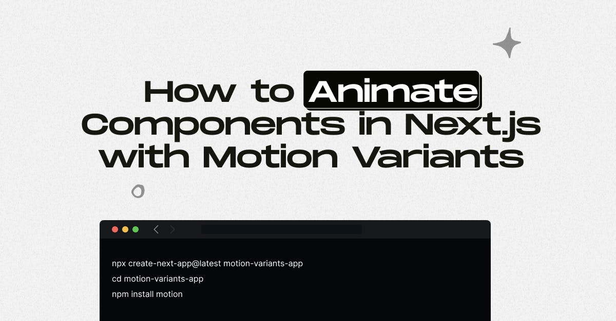
How to Animate Components in Next.js with Motion Variants

Md. Saad
When building modern web interfaces with Next.js, animations can significantly enhance user experience by making your components feel alive and interactive. In this guide, we’re going to animate components using Motion Variants, a powerful abstraction from the Framer Motion library that allows you to define multiple animation states (such as hidden, visible, or exit) in one clean object. This keeps your animation logic centralized, consistent, and easy to reuse across components.
We’ll be using the latest version of Framer Motion, installed via the new motion package, which is designed to work seamlessly with the Next.js App Router and React Server Components. You’ll learn how to set up the project with motion/react, create simple fade-in and slide animations using variants, apply staggered effects to groups of elements, and even trigger animations when components scroll into view using the useInView hook. We’ll walk through real examples using client components and modern Tailwind CSS styling so you can immediately see how each pattern works and reuse them in your projects.
Project Setup with Motion
To get started, we’ll set up a basic Next.js project and install the latest Framer Motion package. This new modular setup supports the App Router and allows proper usage of React Server and Client Components. First, create a new project using the create-next-app command and navigate into it. Then, install the motion package, which gives you access to modern imports like motion/react.
npx create-next-app@latest motion-variants-app
cd motion-variants-app
npm install motionAnimating a Single Component with Variants
In this first example, we’re going to animate a single component—like a card—that fades in and slides up when it loads. The goal is to give a simple yet elegant entrance animation that adds depth to your interface. We achieve this by defining a cardVariants object containing two states: hidden, where the card starts fully transparent and slightly pushed down, and visible, where it becomes fully opaque and returns to its normal position. Then we use the motion.div element from motion/react and assign these states using the initial, animate, and variants props. This approach lets us separate the animation logic from the JSX, making it easy to reuse or adjust later.
// components/AnimatedCard.js
'use client';
import { motion } from 'motion/react';
const cardVariants = {
hidden: { opacity: 0, y: 50 },
visible: { opacity: 1, y: 0 },
};
export default function AnimatedCard({ children }) {
return (
<motion.div
variants={cardVariants}
initial="hidden"
animate="visible"
transition={{ duration: 0.6, ease: 'easeOut' }}
className="p-6 bg-white rounded-xl shadow-md"
>
{children}
</motion.div>
);
}We can now use this animated component inside a page. This renders the card with a smooth entrance motion on page load.
// app/page.js
import AnimatedCard from '@/components/AnimatedCard';
export default function Home() {
return (
<main className="min-h-screen flex items-center justify-center bg-gray-100">
<AnimatedCard>
<h1 className="text-2xl font-bold">Hello Motion</h1>
<p>This card animates using Motion Variants.</p>
</AnimatedCard>
</main>
);
}Animating a Group of Elements with Staggered Motion
Now we’ll animate a group of cards and apply staggered animation so that each card appears one after another. This is useful when you want to animate lists, feature grids, or repeated components to make them feel more dynamic. We start by defining two variants: one for the container and one for each child card. The container variant doesn’t animate visually itself, but it represents a staggerChildren transition that applies a slight delay between each child. The individual item variant defines how each card fades in and slides up. By wrapping each card in a motion.div and applying the shared variant, we achieve a clean, coordinated animation across the group.
// components/CardGroup.js
'use client';
import { motion } from 'motion/react';
const container = {
hidden: {},
visible: {
transition: {
staggerChildren: 0.2,
},
},
};
const item = {
hidden: { opacity: 0, y: 40 },
visible: { opacity: 1, y: 0 },
};
export default function CardGroup({ items }) {
return (
<motion.div
className="grid gap-6 md:grid-cols-3"
variants={container}
initial="hidden"
animate="visible"
>
{items.map((text, index) => (
<motion.div
key={index}
variants={item}
transition={{ duration: 0.5 }}
className="p-4 bg-white rounded shadow"
>
{text}
</motion.div>
))}
</motion.div>
);
}We can pass a list of items to this component and see them animated one by one.
// app/page.js
import CardGroup from '@/components/CardGroup';
export default function Home() {
const cards = ['Card One', 'Card Two', 'Card Three', 'Card Four'];
return (
<main className="p-10 bg-gray-100 min-h-screen">
<CardGroup items={cards} />
</main>
);
}Scroll-Based Animation Using useInView
In this example, we’ll animate a component only when it scrolls into view. This is great for performance and engagement, as it ensures that elements animate only when users see them. We use the useInView hook from react-intersection-observer to detect when a component enters the viewport. Then we use Framer Motion’s useAnimation hook to trigger the animation manually when the element becomes visible. The component starts in a hidden state (opacity 0, pushed down) and animates into a visible state with full opacity and natural position when scrolled into view.
// components/FadeInSection.js
'use client';
import { motion, useAnimation } from 'motion/react';
import { useInView } from 'react-intersection-observer';
import { useEffect } from 'react';
const fadeInVariant = {
hidden: { opacity: 0, y: 60 },
visible: { opacity: 1, y: 0 },
};
export default function FadeInSection({ children }) {
const controls = useAnimation();
const [ref, inView] = useInView({ threshold: 0.2, triggerOnce: true });
useEffect(() => {
if (inView) controls.start('visible');
}, [inView, controls]);
return (
<motion.div
ref={ref}
variants={fadeInVariant}
initial="hidden"
animate={controls}
transition={{ duration: 0.6 }}
className="mb-10"
>
{children}
</motion.div>
);
}
Use this component to wrap any section that should animate only when visible in the viewport.
Final Thoughts
Animating components in Next.js using Framer Motion variants is one of the most effective ways to build clean, interactive, and visually appealing user interfaces. Whether you're adding fade-in effects, scroll-triggered animations, or staggered card entrances, using motion/react and the variants pattern helps keep your codebase modular, scalable, and easier to maintain. These techniques not only improve Next.js performance but also enhance user engagement, a critical factor in reducing bounce rates and increasing time-on-site.
You don’t need heavy JavaScript libraries to create smooth transitions anymore, just the right structure and animation logic powered by modern frameworks.
At StaticMania, we help brands bring their digital presence to life with advanced Next.js and UI animation techniques. From motion-based landing pages to high-performing SPAs, our team combines expert frontend development with thoughtful design. If you need help implementing scroll-based transitions, animation variants, or a full Next.js + Framer Motion architecture, we’ve got you covered, with clean code, fast performance, and real-world results. Let’s build something that looks great and works even better.
So, let's have coffee!
FAQs: Animate Components in Next.js with Motion Variants
Motion Variants are reusable objects that define multiple animation states like hidden, visible, or exit. They allow you to centralise animation logic in Framer Motion, making your code cleaner and more maintainable, especially useful in component-heavy frameworks like Next.js.
To use Framer Motion with the App Router in Next.js 13+, install the motion package and import components from motion/react. You can animate components inside Client Components, while Server Components require importing via motion/react-client.
Use the useInView hook from react-intersection-observer along with Framer Motion's useAnimation. This combo detects when a component enters the viewport and then triggers a defined animation variant using controls.start('visible').
Create a container variant that includes staggerChildren in the transition object. Then assign an item variant to each child component. This ensures that each child animates one after another, creating a smooth, staggered effect.
Not directly. Server Components don’t support browser-only libraries like Framer Motion by default. However, you can use Motion inside Server Components by importing from motion/react-client and rendering the animation logic within Client Components.
Yes. Framer Motion (via the motion package) is fully compatible with React 18 and Next.js 13+. It offers performant, declarative animations with scroll triggers, layout transitions, and route animations—suitable for modern production sites.