April 6, 2025
Mastering Flexbox in Tailwind

Md. Saad
With the help of Flexbox, a powerful CSS layout generator, developers can quickly generate dynamic, responsive designs. With its user-friendly utility classes, Tailwind CSS v4 further expands this feature, making flexible layout deployment even more effortless. This article will cover important classes, sophisticated methods, and real-world examples to help you understand how to use Flexbox in Tailwind.
Understanding Flexbox in Tailwind
Tailwind CSS includes utility classes that let you use Flexbox without creating custom CSS. These classes allow you to construct flexible containers, regulate alignment, alter space, and more.
1. Enabling Flexbox
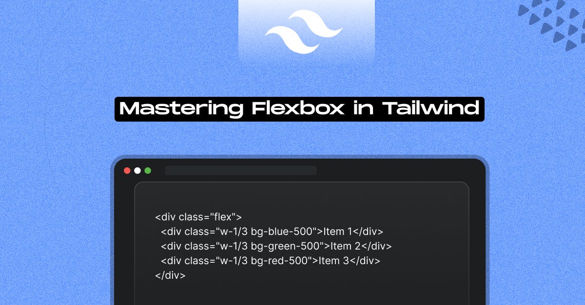
To start using Flexbox, simply apply the flex class to an element:
<div class="flex">
<div class="w-1/3 bg-blue-500">Item 1</div>
<div class="w-1/3 bg-green-500">Item 2</div>
<div class="w-1/3 bg-red-500">Item 3</div>
</div>This makes the container a Flexbox container, and its children will behave as flex items.
2. Controlling Flex Direction
Tailwind offers classes to set the direction of flex items:
- flex-row (default): Items are laid out in a row.
- flex-col: Items are arranged in a column.
- flex-row-reverse: Reverse row order.
- flex-col-reverse: Reverse column order.
Example:
<div class="flex flex-col">
<div class="bg-blue-500">Item 1</div>
<div class="bg-green-500">Item 2</div>
</div>3. Controlling Flex Wrap
To handle wrapping of flex items:
- flex-wrap: Wrap items to the next row/column if needed.
- flex-nowrap: Prevent items from wrapping.
- flex-wrap-reverse: Wrap items in reverse order.
Example:
<div class="flex flex-wrap">
<div class="w-1/4 bg-blue-500">Item 1</div>
<div class="w-1/4 bg-green-500">Item 2</div>
<div class="w-1/4 bg-red-500">Item 3</div>
<div class="w-1/4 bg-yellow-500">Item 4</div>
</div>4. Controlling Flex Basis, Growth, and Shrink
- basis-*: Sets the initial size of a flex item.
- grow: Allows an item to grow. We can also use grow-<number>, grow-[<value>], grow-(<custom-property>) Utilities for controlling how flex items grow.
- shrink: Allows an item to shrink. We can also use shrink-<number>, shrink-[<value>], shrink-(<custom-property>) Utilities for controlling how flex items shrink.
- flex-none: Prevents an item from growing or shrinking.
Example:
<div class="flex">
<div class="basis-1/2 fl grow bg-blue-500">Item 1</div>
<div class="basis-1/4 shrink bg-green-500">Item 2</div>
</div>5. Controlling Order of Flex Items
The order utility defines the visual order of flex items:
- order-1, order-2, ..., order-last: Specifies the order of an item.
Example:
<div class="flex">
<div class="order-2 bg-blue-500">Item 1</div>
<div class="order-1 bg-green-500">Item 2</div>
</div>6. Justifying Content
To align flex items along the main axis, use these classes:
- justify-start: Align items to the start.
- justify-center: Center items.
- justify-end: Align items to the end.
- justify-between: Space items evenly with the first and last items at the edges.
- justify-around: Distribute items with equal space around them.
- justify-evenly: Even spacing between all items.
Example:
<div class="flex justify-between">
<div class="bg-blue-500">Item 1</div>
<div class="bg-green-500">Item 2</div>
<div class="bg-red-500">Item 3</div>
</div>7. Aligning Items and Self
For alignment along the cross-axis, use:
- items-start, items-center, items-end, items-stretch, items-baseline utilities for controlling how flex and grid items are positioned along a container's cross axis.
- self-start, self-center, self-end, self-stretch, self-baseline, self-auto for individual items.
- content-start, content-center,content-end, content-stretch, content-between,content-evenly, content-baseline, content-normal Utilities for controlling how rows are positioned in multi-row flex and grid containers
Example:
<div class="flex items-center h-32 bg-gray-200">
<div class="self-start bg-blue-500">Item 1</div>
<div class="self-end bg-green-500">Item 2</div>
</div>8. Controlling Gaps and Spacing
The gap utility helps control spacing between items.
- gap-<number>, gap-x-<number>, gap-y-<number>, gap-(<custom-property>), gap-x-(<custom-property>), gap-y-(<custom-property>), gap-[<value>], gap-x-[<value>], gap-y-[<value>].
Example:
<div class="flex gap-4">
<div class="bg-blue-500 p-4">Item 1</div>
<div class="bg-green-500 p-4">Item 2</div>
</div>9. Using Place Content, Items, and Self
Tailwind provides utilities to control the alignment of grid and flex items.
- place-content-*: Controls alignment of an entire Flex container.
- place-items-*: Controls alignment of all items.
- place-self-*: Controls alignment of individual items.
Example:
<div class="grid place-items-center h-32 bg-gray-200">
<div class="bg-blue-500">Centered Item</div>
</div>Conclusion
Understanding and effectively implementing Flexbox's utility classes is the key to mastering it in Tailwind. Tailwind's flex utilities also provide more flexibility for creating responsive layouts. Start playing with these utilities in your projects to fully realize Tailwind’s layout powers!
Happy coding and customizing!
Need help with Tailwind problems in your project? Get in Touch With Us Today!