September 7, 2025
Creating Delightful Microinteractions with Motion in Next.js

Md. Saad
Have you ever noticed how a small hover effect or a subtle loading animation can make an interface feel instantly better? Why do some Next.js apps feel polished and intuitive, while others feel flat even when the design looks good?
In modern web development, the difference between a good UI and a delightful one often comes down to microinteractions. These are small, purposeful animations such as button feedback, loading states, and focus indicators that guide users and confirm actions.
Research consistently shows their impact. A Google UX study reports that users are significantly more likely to stay engaged when interfaces provide immediate visual feedback. Forrester Research also found that a well-designed user interface can increase conversion rates by up to 200%, while overall UX improvements can raise conversions by as much as 400%.
With Next.js for performance and Motion for animation, developers can create fast, accessible, and meaningful microinteractions that improve usability without hurting speed or SEO. In this article, you will learn how to build these interactions step by step and apply them effectively in real-world Next.js applications.
What are Microinteractions?
Microinteractions are small, functional animations that give users subtle feedback or enhance usability. Think of:
- A button that scales slightly when clicked
- A loading indicator animating while data is fetched
- A tooltip fading in on focus
- An icon gently bouncing on hover
They may be small, but their impact on UX is massive—adding polish, delight, and clarity to your UI.
Benefits of Microinteractions
Microinteractions have practical UX uses and are not merely decorative elements. The following justifies their inclusion in your Next.js projects:
1. Enhanced User Feedback
Microinteractions let users know their input was received by providing instant visual confirmation for actions like clicks, taps, and hovers.
Example: To let the user know that their action has been recorded, a submit button briefly contracts when tapped.
2. Improved Usability
By emphasizing what is clickable, what is loading, and what has recently changed, they help users navigate workflows.
- To show that it is ready for input, a focused input gently scales and changes color.
3. Reduced Cognitive Load
Small animations help users understand state changes without having to read text or guess what happened.
- Success messages that fade in gently reinforce actions without overwhelming users.
4. Professional Feel
Motion adds polish and makes your interface feel modern and high-quality, setting your project apart.
- Even a simple hover scale effect can make your app feel premium.
5. Accessible Interactions
Thoughtful microinteractions—like animated focus indicators—enhance accessibility for keyboard and screen reader users.
- They help ensure all users, regardless of input method, get clear visual cues.
6. Brand Personality
Custom motion behaviors give your app a unique personality and brand expression.
- A playful bounce or fade-in can make your UI feel more human and memorable.
Getting Started
We’ll use the latest motion library—install it with:
npm install motionThen, import it like this:
import { motion } from 'motion/react'Microinteractions with Code Examples
Here are some useful use cases of microinteractions:
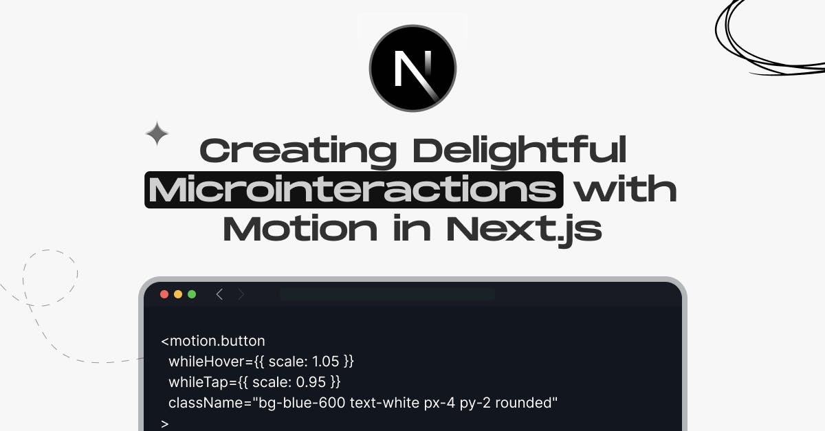
Button Hover & Tap Feedback
This interaction gives your buttons a tactile feel. When users hover or press the button, it slightly grows or shrinks, making the interaction feel more physical.
<motion.button
whileHover={{ scale: 1.05 }}
whileTap={{ scale: 0.95 }}
className="bg-blue-600 text-white px-4 py-2 rounded"
>
Click Me
</motion.button>How it works:
- whileHover enlarges the button slightly.
- whileTap shrinks it on click.
- These scale changes create tactile feedback.
Fade In on Load
Use this effect to gently reveal elements on initial render. It makes the UI feel polished and reduces abrupt layout shifts.
<motion.div
initial={{ opacity: 0 }}
animate={{ opacity: 1 }}
transition={{ duration: 0.5 }}
>
<h2 className="text-xl">Hello World</h2>
</motion.div>How it works:
- initial hides the element.
- animate brings it in.
- transition defines timing.
Slide in From the Left
Slide-in animations help guide the user's eye. Great for headings, sections, or list items.
<motion.div
initial={{ x: -50, opacity: 0 }}
animate={{ x: 0, opacity: 1 }}
transition={{ duration: 0.6 }}
>
<p>This content slides in from the left.</p>
</motion.div>How it works:
- x: -50 starts it off-screen.
- opacity: 0 keeps it invisible.
- Both animate to natural position and full visibility.
Add Focus Animation
Enhance form interactions with subtle animations when users focus on input fields. This microinteraction is useful for improving accessibility and drawing attention to active elements. It makes your form feel more modern and reactive without needing external validation libraries or complex logic.
'use client'
import { motion } from 'motion/react'
import { useState } from 'react'
export function FocusInput() {
const [focused, setFocused] = useState(false)
return (
<motion.div
animate={focused ? { scale: 1.02, borderColor: '#3b82f6' } : { scale: 1, borderColor: '#e5e7eb' }}
transition={{ type: 'spring', stiffness: 300 }}
className="border-2 p-2 rounded"
>
<input
onFocus={() => setFocused(true)}
onBlur={() => setFocused(false)}
className="outline-none w-full"
placeholder="Focus me"
/>
</motion.div>
)
}How it works:
- The parent motion.div animates based on whether the input is focused.
- On focus, it slightly scales up (scale: 1.02) and changes border color to blue (#3b82f6).
- On blur, it reverts back to the default gray border.
- transition uses a spring animation for a smooth bounce-in effect.
- useStatetracks focus state, and onFocus/onBlur handlers toggle it.
This interaction gives immediate, visual feedback that the user is typing — simple, elegant, and effective.
Scroll Reveal (on View)
This component reveals only when scrolled into view. Great for portfolio sections, images, or stats.
'use client'
import { useRef } from 'react'
import { useInView, motion } from 'motion/react'
const RevealOnScroll = () => {
const ref = useRef(null)
const isInView = useInView(ref, { once: true, margin: '-100px' })
return (
<motion.div
ref={ref}
initial={{ opacity: 0, y: 40 }}
animate={isInView ? { opacity: 1, y: 0 } : {}}
transition={{ duration: 0.6 }}
>
<p>This fades in when you scroll to it.</p>
</motion.div>
)
}How it works:
- useInView tracks visibility.
- Animation triggers only once when visible.
Modal Open/Close Animation
This smooth modal animation adds elegance to your overlays.
'use client'
import { useState } from 'react'
import { motion, AnimatePresence } from 'motion/react'
const Modal = () => {
const [open, setOpen] = useState(false)
return (
<>
<button onClick={() => setOpen(true)}>Open Modal</button>
<AnimatePresence>
{open && (
<motion.div
initial={{ opacity: 0, scale: 0.9 }}
animate={{ opacity: 1, scale: 1 }}
exit={{ opacity: 0, scale: 0.9 }}
transition={{ duration: 0.3 }}
className="fixed inset-0 flex items-center justify-center bg-black/50"
onClick={() => setOpen(false)}
>
<div className="bg-white p-6 rounded" onClick={e => e.stopPropagation()}>
<p>This is a modal!</p>
</div>
</motion.div>
)}
</AnimatePresence>
</>
)
}How it works:
- AnimatePresence handles exit animations.
- Scaling and fading make the modal feel natural.
- Clicking outside closes it.
Smooth Scroll to Section
Guide users to sections with smooth transitions. Ideal for nav menus or CTA buttons. You need to add the following CSS to your global styles (e.g., globals.css or inside app/layout.css):
html {
scroll-behavior: smooth;
}Then use a standard anchor link using the Next.js <Link> component.
'use client'
import Link from 'next/link'
export default function NavLink() {
return (
<Link href="#contact" className="text-blue-600 underline">
Contact Us
</Link>
)
}How it works:
- scroll-behavior: smooth makes the browser scroll between anchor targets smoothly.
Staggered Animations for List
Want a list of items to appear one by one? Use staggered motion for a cascading effect.
<motion.ul
initial="hidden"
animate="show"
variants={{
hidden: {},
show: {
transition: {
staggerChildren: 0.2,
},
},
}}
>
{['One', 'Two', 'Three'].map((item, i) => (
<motion.li
key={i}
variants={{
hidden: { opacity: 0, y: 20 },
show: { opacity: 1, y: 0 },
}}
className="mb-2"
>
{item}
</motion.li>
))}
</motion.ul>How it works:
- The parent defines staggerChildren.
- Each list item animates one after the other.
Icon Hover Spin
Spinning icons can show interactivity (like refresh or sync).
<motion.div whileHover={{ rotate: 360 }} transition={{ duration: 0.6 }}>
🔄
</motion.div>How it works:
- whileHover rotates the icon.
- Spins once on each hover.
Toast Message Animation
Spinning icons can show interactivity (like refresh or sync).
<AnimatePresence>
{showToast && (
<motion.div
initial={{ y: -50, opacity: 0 }}
animate={{ y: 0, opacity: 1 }}
exit={{ y: -50, opacity: 0 }}
transition={{ duration: 0.4 }}
className="fixed top-4 right-4 bg-green-600 text-white px-4 py-2 rounded shadow"
>
Form Submitted!
</motion.div>
)}
</AnimatePresence>How it works:
- Toast slides and fades in.
- Disappears on exit via AnimatePresence.
Reusable Microinteractions
The best part? There are motion variants. Instead of repeating animation logic, you can create motion variants. Then you can drop them into any page or layout in your Next.js app.
export const fadeVariant = {
hidden: { opacity: 0 },
show: { opacity: 1, transition: { duration: 0.5 } },
}Then reuse across components:
<motion.div variants={fadeVariant} initial="hidden" animate="show">
<YourContent />
</motion.div>Conclusion
Microinteractions may be small, but their impact on user experience is anything but. Thoughtful animations help users understand what’s happening, confirm their actions, and move through your interface with confidence. When implemented correctly, they reduce friction, improve accessibility, and make your Next.js applications feel responsive and human.
With Motion, developers can build these interactions without unnecessary complexity. Combined with Next.js performance and scalability, microinteractions become a practical UX tool rather than a decorative extra. The key is intention. Every animation should support clarity, usability, and speed, not distract from them.
Ready to turn subtle motion into a competitive advantage?
At StaticMania, we specialise in building high-performance Next.js applications with purposeful microinteractions, accessibility-first motion design, and conversion-focused UX. Our expert development NextJS team blends engineering precision with design strategy to create interfaces that feel smooth, fast, and intuitive at every touchpoint.
If you’re looking to elevate your product with motion that actually improves user experience, StaticMania is here to help. Let’s build interfaces that your users enjoy interacting with.
FAQ
Microinteractions are small animations or visual responses that provide feedback when users interact with an interface. Examples include button hover effects, loading indicators, and form validation cues. They help users understand what’s happening, reduce confusion, and make interfaces feel more responsive and intuitive.
Microinteractions improve usability, accessibility, and perceived performance. In Next.js apps, they help smooth fast page transitions, confirm user actions, and reduce cognitive load. When used correctly, microinteractions can increase engagement, lower bounce rates, and improve conversion rates.
Yes. Motion is production-ready and widely used in modern React and Next.js applications. It is optimized for performance, supports server components, and integrates well with Next.js routing, layouts, and rendering strategies when used correctly.
Well-implemented microinteractions do not harm performance or SEO. Motion animations run on the GPU, avoid layout shifts, and can respect user preferences like reduced motion. Poorly optimized or excessive animations can impact performance, so best practices and testing are essential.
Accessible microinteractions provide clear visual feedback for keyboard, mouse, and touch users. Motion supports reduced-motion preferences, focus animations, and non-intrusive transitions, helping users with motion sensitivity or assistive technologies navigate interfaces more comfortably.
Common examples include button hover and tap animations, input focus highlights, scroll-reveal sections, loading spinners, toast notifications, modal transitions, and subtle icon animations. These interactions guide users and make interfaces feel polished without overwhelming them.