April 20, 2025
How to Implement Animations in Tailwind CSS Projects

Md. Saad
Static designs are a thing of the past! With modern web development, animations and transitions add a dynamic touch to the UI, making it more interactive and engaging. Tailwind CSS, known for its utility-first approach, provides built-in classes for transitions and animations, allowing developers to easily enhance the user experience. This blog will explore how to go beyond static designs with Tailwind’s animation and transition utilities.
Understanding Transitions in Tailwind CSS
Transitions in Tailwind make state changes smoother and more visually appealing. Tailwind offers utility classes to control various aspects of transitions, such as duration, timing function, and delay.
Basic Transition Example
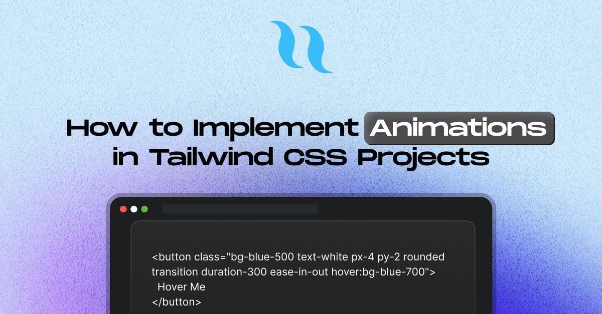
<button class="bg-blue-500 text-white px-4 py-2 rounded transition duration-300 ease-in-out hover:bg-blue-700">
Hover Me
</button>In this example:
- transition enables transition effects.
- duration-300 sets the transition duration to 300ms.
- ease-in-out applies an easing function for a smooth effect.
- hover:bg-blue-700 changes the background color on hover.
Customizing Transitions
Tailwind provides various utilities to control transitions precisely:
- transition – Enables transition effects.
- transition-none – Disables transitions.
- transition-all – Applies transition to all properties.
- transition-colors – Transitions only color-related properties.
- transition-opacity – Transitions opacity changes.
- transition-transform – Applies transition to transformations like scale and rotate.
- transition-shadow – Applies transition to box shadows.
- transition-[<value>] – Applies transition to height changes.
- transition-(<custom-property>) – Applies transition to width changes.
Transition Timing, Duration, and Delay Classes
- Duration: Controls the speed of transition effects:
duration-<number>, duration-initial, duration-(<custom-property>), duration-[<value>] - Easing Functions: Specifies the transition effect curve:
ease-linear, ease-in, ease-out, ease-in-out,ease-initial, ease-(<custom-property>), ease-[<value>] - Delay: Adds a delay before the transition starts:
delay-<number>, delay-(<custom-property>), delay-[<value>]
Example:
<div class="w-16 h-16 bg-red-500 transition-transform duration-500 ease-in-out delay-200 hover:scale-125">
Content
</div>Here, the hover:scale-125 enlarges the div when hovered with a smooth delay of 200ms.
Animations in Tailwind CSS
Animations bring elements to life by defining keyframes. Tailwind includes predefined animations like animate-ping, animate-spin, animate-bounce, and animate-pulse.
Using Built-in Animations
<div class="w-10 h-10 bg-green-500 rounded-full animate-bounce"></div>This creates a bouncing effect using Tailwind’s built-in animation.
Creating Custom Animations in V3
Tailwind allows defining custom keyframe animations using @keyframes in your CSS file or the extend property in tailwind.config.js.
Example of a Fade-in Animation:
Step 1: Extend Tailwind Config
module.exports = {
theme: {
extend: {
animation: {
fadeIn: "fadeIn 2s ease-in forwards",
},
keyframes: {
fadeIn: {
"0%": { opacity: 0 },
"100%": { opacity: 1 },
},
},
},
},
plugins: [],
};Step 2: Apply the Animation
<div class="w-20 h-20 bg-purple-500 animate-fadeIn"></div>Customizing Animations with Tailwind v4
With Tailwind CSS v4, you can customise animation utilities using --animate-* theme variables. This allows defining animations directly in your theme without modifying the config file.
Example: Adding a Wiggle Animation
You can define a custom wiggle animation using Tailwind’s @theme directive:
@theme {
--animate-wiggle: wiggle 1s ease-in-out infinite;
@keyframes wiggle {
0%,
100% {
transform: rotate(-3deg);
}
50% {
transform: rotate(3deg);
}
}
}Now, you can apply the animate-wiggle utility in your markup:
<div class="animate-wiggle">
<!-- Content here -->
</div>This element will continuously wiggle back and forth, creating a playful animation effect.
Combining Transitions and Animations
You can combine transitions and animations to create stunning effects. Example:
<button class="bg-indigo-500 text-white px-6 py-3 rounded-full transition-transform duration-300 ease-in-out hover:scale-110 animate-bounce">
Click Me
</button>This button scales up slightly when hovered while continuously bouncing.
Conclusion
Tailwind CSS provides a powerful yet simple way to add animations and transitions to your project. With built-in utilities and the ability to customize animations using keyframes and theme variables in Tailwind v4, you can go beyond static designs and create an interactive user experience. Experiment with different effects and bring your UI to life!
Are you using animations and transitions in your Tailwind projects? Contact StaticMania to add animation to your website.
FAQs
In Tailwind CSS, transitions can be added easily using utility classes like transition, duration, and ease-in-out. These classes allow you to create smooth changes between different states, such as hover effects or click actions, without writing custom CSS.
Yes, Tailwind CSS provides classes to control transition speed (duration) and add delays (delay). You can fine-tune how quickly or slowly a transition happens, making your UI interactions feel more natural and responsive.
Tailwind CSS includes several predefined animations such as bounce, pulse, spin, and ping. These animations can be applied directly using simple utility classes, adding dynamic motion to elements without requiring manual keyframe creation.
You can define custom animations in Tailwind by extending the theme configuration. This involves setting up custom keyframes and associating them with new animation classes, giving you full control over how elements move or behave on the page.
Transitions handle smooth changes between element states, like color or size on hover. Animations, on the other hand, define continuous or repeating movements using keyframes, such as bouncing, fading, or spinning effects.
Absolutely. You can use both transitions and animations together to create more dynamic effects. For example, you can apply a smooth scale transition on hover while also having a continuous bounce animation running.