June 1, 2025
How to Use Tailwind CSS 4 for Fully Responsive Web Design

Md. Saad
Creating responsive websites that look sharp on any device is no longer a nice-to-have; it’s necessary. With Tailwind CSS 4, responsive design is more powerful and flexible than ever. From container queries to arbitrary media utilities, Tailwind lets you control layout behaviour directly in your markup without bloated CSS files.
Whether you’re building landing pages, dashboards, or reusable components, this guide will show you how to master responsive techniques using Tailwind’s latest features. If you’re a web developer looking to speed up development and improve UX across devices, you’re in the right place.
The Power of Flexible Utility Variants
Tailwind's mobile-first breakpoint system is the foundation of its responsive design capabilities. A straightforward syntax can be used to conditionally apply each Tailwind utility class at various breakpoints: Use the breakpoint name and a colon to prefix the class.
Example:
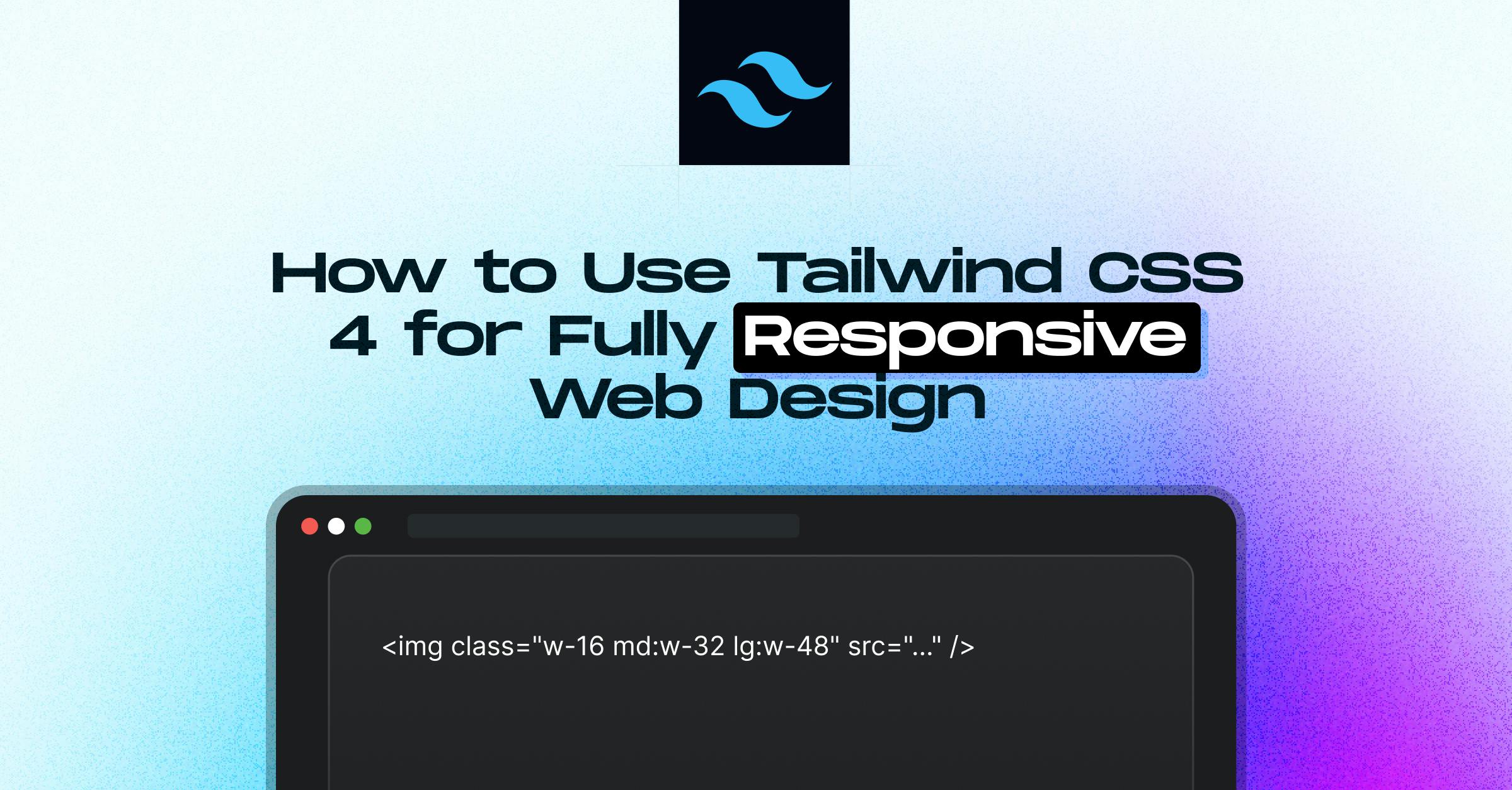
<img class="w-16 md:w-32 lg:w-48" src="..." />This increases the width to w-32 on medium screens and w-48 on large screens, while maintaining the default width of w-16.
| Prefix | Min Width | Media Query |
|---|---|---|
| sm |
640px |
@media (min-width: 640px) |
| md |
768px |
@media (min-width: 768px) |
| lg |
1024px |
@media (min-width: 1024px) |
| xl |
1280px |
@media (min-width: 1280px) |
| 2xl |
1536px |
@media (min-width: 1536px) |
These prefixes can be applied to any utility class, including layout, typography, and spacing.
Example from the Real World: Responsive Card Elements
<div class="mx-auto max-w-md overflow-hidden rounded-xl bg-white shadow-md md:max-w-2xl">
<div class="md:flex">
<div class="md:shrink-0">
<img class="h-48 w-full object-cover md:h-full md:w-48" src="/img/building.jpg" alt="Modern building architecture" />
</div>
<div class="p-8">
<div class="text-sm font-semibold tracking-wide text-indigo-500 uppercase">Company retreats</div>
<a href="#" class="mt-1 block text-lg leading-tight font-medium text-black hover:underline">Incredible accommodation for your team</a>
<p class="mt-2 text-gray-500">Looking to take your team away on a retreat to enjoy awesome food and take in some sunshine? We have a list of places to do just that.</p>
</div>
</div>
</div>- By default, the layout is stacked; with md:flex, it changes to side-by-side.
- When the image is in flex mode, md:shrink-0 stops it from shrinking.
- md:h-full and md:w-48 are used to adjust height and width. These prefixes can be applied to any utility class, including layout, typography, and spacing.
Best Practices For Mobile-First Development
Unprefixed utilities prioritise mobile devices because they work on all screen sizes. Use the proper breakpoint prefix to override these on larger screens.
<!-- Good practice -->
<div class="text-center sm:text-left"></div>This aligns the text to the left on sm and up, and centres it on mobile devices.
Focusing on Breakpoint Areas
Tailwind allows breakpoints to be combined using max-* variations:
<div class="md:max-xl:flex">
<!-- Only flex between md and xl -->
</div>Do you want to focus on a single breakpoint? Put two together:
<div class="md:max-lg:flex">
<!-- Applies only between 768px and 1024px -->
</div>Customizing Breakpoints
With Tailwind 4, you can use @theme in your CSS to define unique breakpoints:
@theme {
--breakpoint-xs: 30rem;
--breakpoint-2xl: 100rem;
--breakpoint-3xl: 120rem;
}Next, incorporate them into your markup:
<div class="grid xs:grid-cols-2 3xl:grid-cols-6">
<!-- Custom responsive grid -->
</div>One-Off Responsive Utilities with Arbitrary Values
Any media query using min-[value] or max-[value] is supported by Tailwind:
<div class="max-[600px]:bg-sky-300 min-[320px]:text-center">
<!-- Custom breakpoints without theme config -->
</div>Container Queries in Tailwind 4
Container queries, one of Tailwind CSS 4's most significant additions, allow you to apply styles based on a parent container's size rather than the viewport. As a result, components become more context-aware and modular.
Basic Usage
<div class="@container">
<div class="flex flex-col @md:flex-row">
<!-- Adjusts layout based on container size -->
</div>
</div>Container queries are mobile-first, just like responsive utilities.
Max-Width Container Queries
<div class="@container">
<div class="flex flex-row @max-md:flex-col">
<!-- Switches layout below md size -->
</div>
</div>Targeting a Range
<div class="@container">
<div class="flex flex-row @sm:@max-md:flex-col">
<!-- Only applies between sm and md -->
</div>
</div>Named Containers
Deeply nested layouts benefit greatly from named containers:
<div class="@container/main">
<div class="flex flex-row @sm/main:flex-col">
<!-- Targets 'main' container specifically -->
</div>
</div>Custom Container Sizes
Use the --container-* variables to increase container sizes:
@theme {
--container-8xl: 96rem;
}Utilise in markup:
<div class="@container">
<div class="flex flex-col @8xl:flex-row">
<!-- Applies above 96rem container width -->
</div>
</div>Arbitrary Container Breakpoints
<div class="@container">
<div class="flex flex-col @min-[475px]:flex-row">
<!-- Applies above 475px container size -->
</div>
</div>Container Units
For container-relative widths, use units such as cqw:
<div class="@container">
<div class="w-[50cqw]">
<!-- Width is 50% of the container -->
</div>
</div>Conclusion
Tailwind CSS 4 redefines responsive design by making it faster, more intuitive, and more maintainable. With container queries, flexible breakpoints, and utility-first responsiveness, you can build layouts that adapt beautifully to any screen or context—all from within your HTML. Whether you're working on scalable UI components or complex layouts, these tools save time and reduce code overhead. If you aim to improve user experience across devices without wrestling with custom media queries, Tailwind 4 is the way forward. Now’s the time to build a responsive design smarter, not harder.
At StaticMania, we help businesses and dev teams implement responsive web design using Tailwind CSS 4 with precision and performance in mind. From dynamic components to full-site builds, we create scalable, mobile-first experiences that adapt to any screen size. Our developers specialise in utility-first frameworks and modern CSS, making us a go-to partner for agencies, SaaS platforms, and product teams.
Whether you're migrating or starting fresh, we turn Tailwind’s responsive power into fast, clean, production-ready code that supports long-term growth. Let’s bring responsive UI to life, done right the first time.
FAQs
Tailwind CSS 4 introduces container queries, improved breakpoint handling, arbitrary media queries, and CSS-first customization. These features make it easier to build responsive layouts without relying heavily on media queries in external stylesheets.
Wrap your component in a @container class and use @md: or similar prefixes within the container to adjust the layout based on the parent’s width instead of the viewport. This is ideal for modular design systems.
Tailwind uses a mobile-first system with these defaults:
- sm: 640px
- md: 768px
- lg: 1024px
- xl: 1280px
- 2xl: 1536px
These can be used to apply different utilities to each screen size.
Yes, you can define custom breakpoints using the @theme directive in your CSS. This lets you create responsive utilities for unique screen sizes or design constraints without editing the config file.
Prefix any utility with a breakpoint name, like md:flex, to conditionally apply it. Tailwind applies the unprefixed class for mobile-first and overrides it at larger breakpoints.
The mobile-first design ensures your site performs well on small devices by default. It improves accessibility, performance, and UX while keeping your code lean and future-proof.
Tailwind allows max-based queries (like @max-md) and range targeting (e.g., md:max-xl:flex) for refined control. This helps create precise responsive behaviour between specific screen widths.
Units like cqw (container query width) let you size elements relative to the container, not the viewport. For example, w-[50cqw] means 50% of the container’s width.
Yes. With Tailwind 4’s CSS-first approach, you can use @theme and arbitrary values directly in your markup or CSS without changing the configuration file.
Tailwind CSS 4 gives you more flexibility, less boilerplate, and faster workflows. With features like container queries, arbitrary breakpoints, and improved utility syntax, it simplifies building responsive UIs across devices.