June 22, 2025
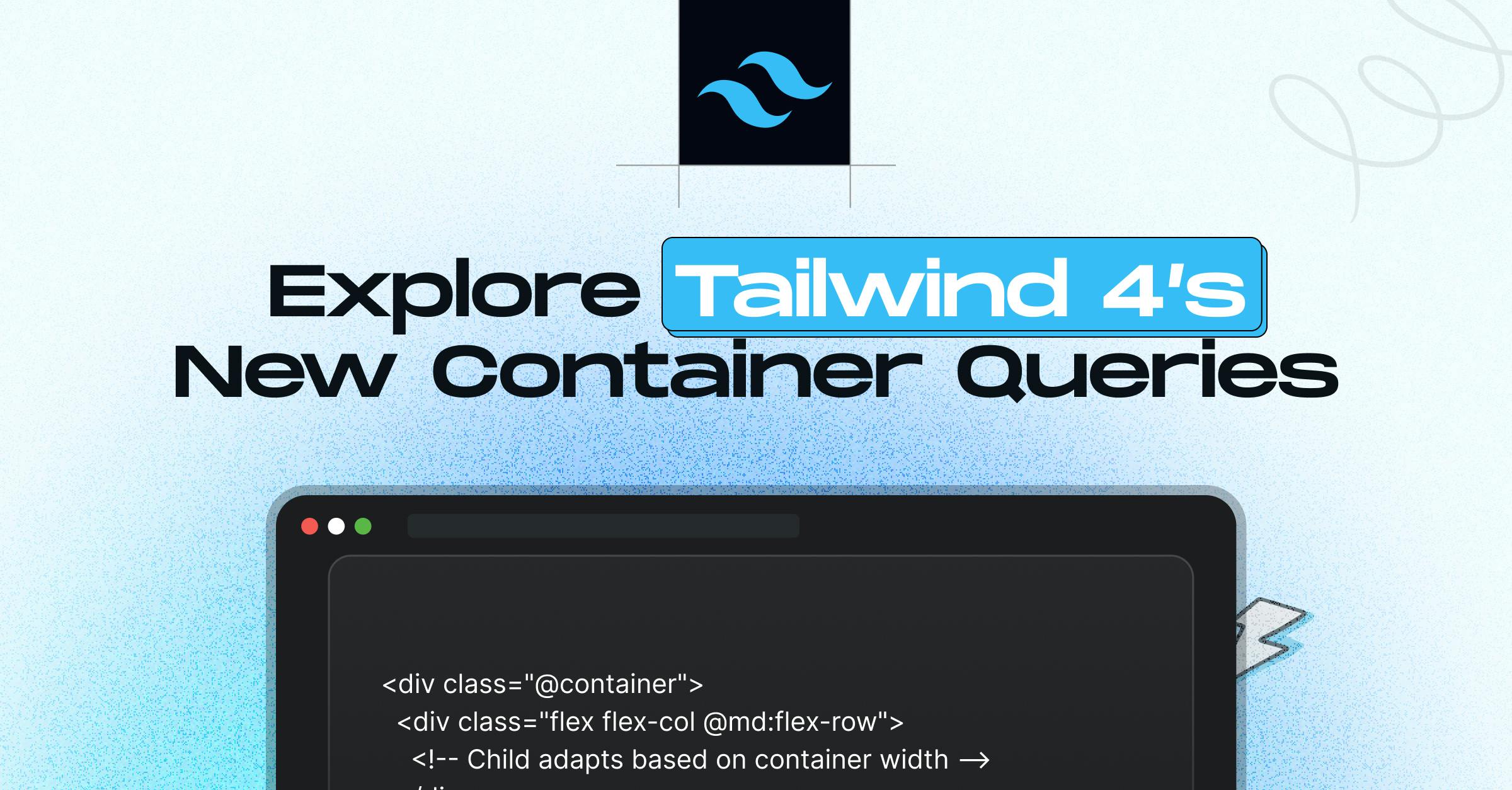
Explore Tailwind 4’s New Container Querie

Md. Saad
Responsive design just got a major upgrade. With the introduction of container queries in Tailwind CSS 4, developers can now style components based on the size of their parent container, rather than just the screen. That means more flexible, layout-aware designs that adapt seamlessly across sections, sidebars, and nested components.
If you’ve ever struggled with media queries not fitting every layout scenario, this is the feature you’ve been waiting for. In this article, we’ll explain how container queries work in Tailwind 4 and how you can start using them to build smarter, scalable UIs.
Basic Usage with Tailwind 4
With the help of @container and container query variations like @sm, @md, and others, Tailwind CSS 4 offers a clear, consistent syntax.
Basic Example
Use the @container utility on a parent, and then use responsive container query variants on children:
<div class="@container">
<div class="flex flex-col @md:flex-row">
<!-- Child adapts based on container width -->
</div>
</div>Similar to screen-based breakpoints, Tailwind's container queries prioritise mobile devices; styles are applied at the target size and higher.
What Are Container Queries?
Generally, viewport-size-based media queries have been the mainstay of responsive design. When working with components within intricate layouts, this tactic may not be as effective. For instance, media queries won't help if a sidebar card needs to look different depending on whether it's in a large main area or a small sidebar.
Container queries resolve this problem. Instead of reacting to screen size, they react to the size of the parent container. Components can now adapt in place, increasing their reusability and layout independence.
Max-Width Container Queries
You can also use max-width variants, such as @max-sm, @max-md, etc., to apply styles below a certain container size.
<div class="@container">
<div class="flex flex-row @max-md:flex-col">
<!-- Becomes vertical on narrower containers -->
</div>
</div>Container Query Ranges
Target a specific range by combining min- and max-width queries:
<div class="@container">
<div class="flex flex-row @sm:@max-md:flex-col">
<!-- Applies only between sm and md container widths -->
</div>
</div>Named Containers
When working with nested container contexts, you can give containers a name and target specific ones:
<div class="@container/main">
<div class="flex flex-row @sm/main:flex-col">
<!-- Styles depend on the 'main' container size -->
</div>
</div>This is especially useful when elements need to react to non-nearest containers in deeply nested layouts.
Custom Container Sizes
You can extend Tailwind with custom container breakpoints using --container-* variables:
app.css
@import "tailwindcss";
@theme {
--container-8xl: 96rem;
}Then in your HTML:
<div class="@container">
<div class="flex flex-col @8xl:flex-row">
<!-- Applies when container is at least 96rem wide -->
</div>
</div>Arbitrary Container Queries
For precise control without editing the theme, use arbitrary container query values like:
<div class="@container">
<div class="flex flex-col @min-[475px]:flex-row">
<!-- Applies when container ≥ 475px -->
</div>
</div>You can also do:
<div class="@container">
<div class="flex flex-col @max-[640px]:flex-row">
<!-- Applies when container < 640px -->
</div>
</div>Using Container Units (cqw, cqh)
Tailwind 4 lets you use container query units such as cqw (container width) in utility classes:
<div class="@container">
<div class="w-[50cqw]">
<!-- Element is always 50% of the container width -->
</div>
</div>These units are perfect for responsive layouts where element size should scale with the container.
Container Size Reference
By default, Tailwind CSS includes a range of predefined container breakpoints:
| Variant | Min Width | CSS Equivalent |
|---|---|---|
| @3xs |
16rem (256px) |
@container (min-width: 16rem) |
| @2xs |
18rem (288px) |
@container (min-width: 18rem) |
| @xs |
20rem (320px) |
@container (min-width: 20rem) |
| @sm |
24rem (384px) |
@container (min-width: 24rem) |
| @md |
28rem (448px) |
@container (min-width: 28rem) |
| @lg |
32rem (512px) |
@container (min-width: 32rem) |
| @xl |
36rem (576px) |
@container (min-width: 36rem) |
| @2xl |
42rem (672px) |
@container (min-width: 42rem) |
| @3xl |
48rem (768px) |
@container (min-width: 48rem) |
| @4xl |
56rem (896px) |
@container (min-width: 56rem) |
| @5xl |
64rem (1024px) |
@container (min-width: 64rem) |
| @6xl |
72rem (1152px) |
@container (min-width: 72rem) |
| @7xl |
80rem (1280px) |
@container (min-width: 80rem) |
You can also define your sizes for full customization.
Real-World Example: Responsive Card Design
Here is a detailed, practical example of a responsive profile card that adapts to its container width instead of screen size.
<div class="@container bg-white shadow-md rounded-lg p-6 max-w-3xl mx-auto">
<div class="flex flex-col gap-4 @sm:flex-row @sm:items-center">
<img src="https://via.placeholder.com/100" alt="Avatar" class="w-24 h-24 rounded-full mx-auto @sm:mx-0" />
<div class="text-center @sm:text-left">
<h2 class="text-xl font-semibold @sm:text-2xl @md:text-3xl">Jane Doe</h2>
<p class="text-gray-600 @max-sm:hidden">
Senior Frontend Developer with a passion for clean UI and container-aware components.
</p>
</div>
</div>
</div>What’s happening:
- On small containers (< 24rem), the layout stacks vertically with centered content.
- At @sm (≥ 24rem), it switches to horizontal (flex-row) and left-aligns text.
- At @md (≥ 28rem), the heading becomes larger for more visual impact.
- The description is hidden on the smallest containers (@max-sm:hidden) to save space.
Conclusion
At StaticMania, we specialise in building responsive, performance-driven interfaces using the latest Tailwind features. From clean architecture to seamless container-aware components, our team ensures your UI works beautifully at every screen and layout size.
Whether refactoring an existing app or starting a new project, we help you make the most of Tailwind’s powerful design system.
Need help implementing container queries or building a layout-aware UI from scratch?
Schedule a consultation with StaticMania and let us bring your design system to life, efficiently, responsively, and cleanly.
FAQs
Container queries in Tailwind CSS 4 allow components to adapt their styles based on the size of their parent container rather than the viewport. This makes designs more modular and responsive within complex layouts.
While media queries respond to the overall screen size, container queries react to the size of a specific container element. This allows components to adjust based on their local context, improving layout flexibility and reusability.
The @container utility enables container query support by designating an element as a size-aware container. Child elements can then use container-based responsive classes like @sm or @max-md within that context.
Yes, Tailwind 4 allows you to define custom container breakpoints using-- container-* variables via the @theme directive. You can also use arbitrary values for precise control without editing the config file.
Tailwind 4 supports container query units such as cqw (container width) and cqh (container height), which let you size elements proportionally to their parent container instead of the viewport.
Container queries improve the responsiveness of reusable components by allowing them to adapt independently of page layout. This aligns well with modern, component-first development workflows and enhances maintainability.