April 27, 2025
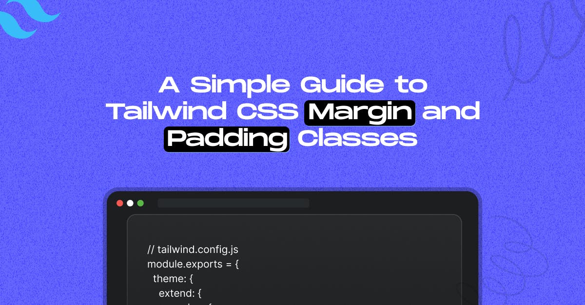
A Simple Guide to Tailwind CSS Margin and Padding Classes

Md. Saad
Tailwind CSS is well-known for its utility-first approach, enabling developers to create responsive and clean UIs quickly. One of its core design systems is spacing, specifically the margin and padding classes. If you're new to Tailwind or need a refresher, this article will take you through all you need to know to understand spacing in Tailwind.
How Tailwind's Spacing Scale Works
Tailwind uses a spacing scale based on rem units. The classes follow a simple numeric naming convention like p-1, m-2, pt-4, etc.
Behind the scenes, Tailwind maps these numbers to fixed spacing values. For example:
- 1 = 0.25rem (4px)
- 2 = 0.5rem (8px)
- 3 = 0.75rem (12px)
- 4 = 1rem (16px)
- And so on…
Each stage increases the spacing regularly and predictably, allowing you to keep a unified layout throughout your design. You don't need to recall specific pixel values; choose an appropriate quantity for your required area.
This scale is applied across both margin and padding utilities, and it’s consistent throughout your project.
Margin Classes
Margin classes start with m and can target all sides or specific directions:
- m-4: all sides
- mt-4: top
- mr-4: right
- mb-4: bottom
- ml-4: left
- mx-4: left and right (horizontal)
- my-4: top and bottom (vertical)
Negative Margins
Tailwind also supports negative margins using a - prefix:
- -mt-2: negative top margin
- -mx-4: negative horizontal margin
Padding Classes
Padding uses the same scale and naming logic, but with p:
- p-4: All sides
- pt-4: top
- pr-4: right
- pb-4: bottom
- pl-4: left
- px-4: horizontal
- py-4: vertical
Unlike margin, padding does not support negative values—because negative padding isn’t valid CSS.
Responsive Spacing
Tailwind makes it easy to apply different spacing at different screen sizes using responsive prefixes:
<div class="p-4 md:p-8 lg:p-12">
Responsive padding!
</div>This means
- On small screens, padding is 1rem
- On medium (md) screens, it's 2rem
- On large (lg) screens, it's 3rem
Arbitrary Values
Need ultra-specific spacing? Tailwind supports arbitrary values:
<div class="mt-[18px]">
Custom margin-top!
</div>This gives you fine-tuned control for when the spacing scale doesn’t quite fit your design.
Configuring the Spacing Scale in Tailwind CSS V3
Need a custom spacing value? You can extend or override the default spacing scale in your tailwind.config.js file.
Extending the scale:
// tailwind.config.js
module.exports = {
theme: {
extend: {
spacing: {
'72': '18rem',
'84': '21rem',
'96': '24rem',
'128': '32rem',
},
},
},
}This adds more options to the default scale without removing anything.
Overriding the scale
To completely replace the default values with your own:
module.exports = {
theme: {
spacing: {
'0': '0px',
'1': '0.125rem',
'2': '0.25rem',
'custom': '7.5rem',
},
},
}Note: This wipes out all defaults, so redefine any values you still need.
Configuring the Spacing Scale in Tailwind CSS V4
Tailwind's spacing utility classes — including those for both padding (p-, px-, py-, pt-, pr-, pb-, pl-, ps-, pe-) and margin (m-, mx-, my-, mt-, mr-, mb-, ml-, ms-, me-) — are all based on the --spacing theme variable.
You can customize this base spacing scale by defining your own value in the theme configuration:
@theme {
--spacing: 1px;
}By setting --spacing, you control the foundational unit used across all spacing utilities, making it easy to adjust the rhythm and layout of your design consistently.
Pro Tips
- Use space-x-* or space-y-* to add spacing between sibling elements.
- Stick to the default scale where possible to keep designs consistent.
- Use gap-* for grid and flex layouts instead of margin on children.
Conclusion
Tailwind's spacing tactics promote uniformity, flexibility, and speed. Once you've mastered the naming and scaling, keeping your Tailwind layouts clean and organised will be a breeze.
Whether you're creating a simple card or a complicated UI, understanding margin and padding in Tailwind can help you improve your front-end skills.
Need help with Tailwind problems in your project? Get in Touch With Us Today!