May 11, 2025
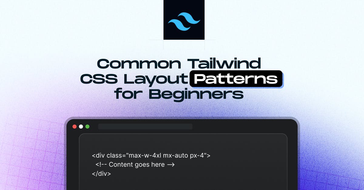
Common Tailwind CSS Layout Patterns for Beginners

Md. Saad
Wondering how to build real-world layouts with Tailwind CSS? You're not alone. When you're just starting out, the number of utility classes can feel overwhelming. But once you understand a few core patterns, building clean, responsive layouts becomes much easier.
Whether you're working on a blog, dashboard, or landing page, this guide walks you through beginner-friendly layout structures using Tailwind’s utility classes, with no custom CSS required. These patterns will save you time and give your site a professional edge. Let’s break down the layouts you’ll use most, so you can design faster and smarter.
These patterns will be your go-to tools for creating a blog, dashboard, or landing page.
1. Centred Container
Centered container is one of the most used pattern in modern website. Tailwind utility classes help you to keep your content aligned easily .
<div class="max-w-4xl mx-auto px-4">
<!-- Content goes here -->
</div>What's happening here?
- max-w-4xl: Limits the container width.
- mx-auto: Horizontally centres the container.
- px-4: Adds horizontal padding for spacing on smaller screens.
2. Full-Screen Centred Content
We can use full-screen centered content, which is perfect for splash pages or hero sections.
<div class=" flex items-center justify-center h-screen">
<h1 class="text-3xl font-bold"> Welcome to My Site </h1>
</div>Breakdown:
- flex: Enables Flexbox layout.
- items-center: this centers the content Vertically .
- justify-center: It centers horizontally.
- h-screen: This makes the div full height of the screen.
3. Navbar with Space Between Items
Navigation bars are important in a website, and Tailwind makes it super easy to create and to space items apart.
<nav class="flex items-center justify-between p-4 bg-gray-100">
<div class="text-lg font-semibold"> Logo </div>
<ul class="flex space-x-6">
<li><a href="#"> Home </a></li>
<li><a href="#"> About </a></li>
<li><a href="#"> Contact </a></li>
</ul>
</nav>Here, we can use justify-between to spread items, and space-x-* to space out links.
4. Responsive Grid Layout
Tailwind’s grid utilities help you build responsive layouts without writing media queries.
<div class="grid grid-cols-1 sm:grid-cols-2 md:grid-cols-3 gap-6">
<div class="bg-white p-4 shadow rounded"> Card 1 </div>
<div class="bg-white p-4 shadow rounded"> Card 2 </div>
<div class="bg-white p-4 shadow rounded"> Card 3 </div>
</div>- grid-cols-1, sm:grid-cols-2, etc.: Control how many columns show at different breakpoints.
- gap-6: Adds consistent spacing between items
5. Sticky Footer Layout
Ensure your footer stays at the bottom even if the content is short.
<body class="min-h-screen flex flex-col">
<main class="flex-grow">
<!-- Page content -->
</main>
<footer class="bg-gray-200 p-4 text-center">
© 2025 My Site
</footer>
</body>- flex flex-col: Stacks children vertically.
- flex-grow on main: Pushes the footer down if content is short.
6. Card Component with Image and Text
Common in blog layouts or product listings.
<div class="max-w-sm rounded overflow-hidden shadow-lg">
<img class="w-full" src="https://via.placeholder.com/400x200" alt="Card image">
<div class="px-6 py-4">
<h2 class="font-bold text-xl mb-2"> Card Title </h2>
<p class="text-gray-700 text-base"> Some brief description goes here. </p>
</div>
</div>Tailwind makes it easy to compose beautiful UI components with utility classes.
7. Sidebar Layout with Main Content
Great for dashboards or admin panels.
<div class="flex min-h-screen">
<aside class="w-64 bg-gray-800 text-white p-4">
<!-- Sidebar content -->
</aside>
<main class="flex-1 p-6">
<!-- Main content -->
</main>
</div>- flex: Horizontal layout.
- w-64: Fixed width for the sidebar.
- flex-1: Main content fills the remaining space.
8. Use container for Consistent Layout Widths
Tailwind offers a container class that automatically sets a responsive max-width and centers your content.
<div class="container mx-auto px-4">
<!-- Content goes here -->
</div>It’s a great starting point for almost any layout. You can also customize the container’s breakpoints in your tailwind.config.js in V3 or from the @theme directive in V4.
9. Think Mobile-First with Responsive Utilities
Tailwind follows a mobile-first approach. Start with base styles, then layer on changes for larger screens.
<div class="p-4 sm:p-6 md:p-8 lg:p-10">
<!-- Padding increases on larger screens -->
</div>This gives you precise control over how your layout adapts across devices without writing custom media queries.
10. Align Elements Easily with flex and grid
Whenever you're unsure how to position something, reach for flex or grid. These two utilities solve so many layout headaches.
- Use flex items-center justify-between to quickly align navbar items.
- Use grid grid-cols-2 for neat two-column layouts.
- Add gap-* to easily manage spacing between items.
11. Utility Stacking = Reusability + Speed
One of the strengths of Tailwind is how easy it is to compose utilities to create consistent design blocks.
Example:
<div class="bg-white p-6 rounded-xl shadow-md">
<!-- A reusable card block -->
</div>Save combinations like this as components in your code or extract them using tools like Tailwind's @apply directive in CSS files.
12. Debug Layouts with Borders and Background Colors
Having trouble seeing how elements are positioned? Temporarily add debug styles:
<div class="border border-red-500 bg-yellow-100">
<!-- Helps visualize spacing and alignment -->
</div>These visual cues can help you troubleshoot spacing, alignment, and size issues quickly.
13. Use space-* for Cleaner Vertical and Horizontal Stacking
Instead of manually adding margin between elements, use the space-y-* or space-x-* classes:
<div class="flex flex-col space-y-4">
<div> Item 1 </div>
<div> Item 2 </div>
<div> Item 3 </div>
</div>Much cleaner and more maintainable than setting individual margins!
Bonus Tip: Don’t Forget Tailwind Plugins!
Tailwind has powerful plugins like
- @tailwindcss/forms: For beautiful form elements.
- @tailwindcss/typography: For clean blog-style content.
- @tailwindcss/aspect-ratio: For responsive image and video containers.
These can save tons of time and enhance layout consistency across your site.
Conclusion
Mastering layout patterns in Tailwind CSS is a game-changer for building clean, responsive, and maintainable websites without relying on custom CSS or complex frameworks. From centered containers to responsive grids and sticky footers, these patterns cover the essentials in everyday projects. Once you get comfortable using utility classes, you'll work faster with more design consistency across pages.
If you need expert help implementing Tailwind CSS in real-world projects or want to build performance-driven layouts that scale, StaticMania’s development team is ready to assist. We specialize in utility-first design systems that deliver speed, structure, and pixel-perfect results.
Need help with Tailwind problems in your project? Get in Touch With Us Today!
FAQs
Some of the most used layout patterns in Tailwind CSS include centered containers, full-screen hero sections, responsive grid layouts, navigation bars, sticky footers, and sidebar-main layouts. These patterns help build real-world UI structures with minimal custom CSS.
Tailwind provides grid and grid-cols-* utility classes to create responsive grid layouts. You can use breakpoint prefixes (e.g., sm:, md:) to adjust the number of columns based on screen size—no media queries are needed.
To center content horizontally, use mx-auto. For vertical centering, combine flex, items-center, and justify-center. This is especially useful for hero sections and splash pages that need perfectly centered text or images.
Use a flex layout on the <body> or main wrapper with flex-col and apply flex-grow to the main content section. This pushes the footer to the bottom even if the page content is short.
You can use flex with justify-between to spread out items and space-x-* to control the spacing between links. This creates a clean, responsive navbar without needing additional styling.
Yes, Tailwind follows a mobile-first approach. Start with base styles and layer on changes for larger breakpoints using responsive prefixes like sm:, md:, and lg:. This ensures your layouts adapt across all screen sizes.