June 17, 2024
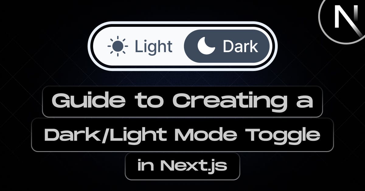
Guide to Creating a Dark/Light Mode Toggle in Next.js

Md. Saad
Implementing dark and light modes in web applications significantly enhances user experience by considering individual preferences and comfort. Nowadays, it has become an important design culture. Applying this feature allows you to render your app more user-focused and demonstrate your dedication to meeting your users' varied demands and preferences. Additionally, it meets current trends in design seamlessly. Using Next.js we can easily integrate dark/light mode in our web applications. In this article, I will guide you through the steps that need to implement dark mode in a Next.js Application.
Prerequisites
To follow along with this guide and code, you should have the following:
- Basic understanding of HTML, CSS, and JavaScript
- At least a little experience or knowledge of Next.js.
- Node and npm or yarn installed on your local computer
Setting up a Next.js Application
The first and foremost step to begin with is creating a Next.js App. Use the following command to create a next.js app.
npx create-next-app app-name
As it is not an article on creating the next.js app, we will not discuss it in detail. If you want to read it in detail follow the link.
Install the next-themes library
First, we need to find the user's local storage default theme. Then we have to set functionality to toggle between and store the current to prevent the theme from returning to default when the user leaves the site also. One method for achieving this would be to manipulate the DOM utilizing local storage. The next-themes library will help us with this.
We'll utilise the next-themes library to simplify the implementation of dark mode. By installing it via npm, we gain access to convenient hooks and components that manage the underlying logic. This library streamlines the process, allowing us to easily switch between light and dark themes, ensuring a smooth and efficient integration into our website.
npm install next-themesCreate Theme Provider from next-themes
Now, we have to create a custom ThemeProvider component. To do that create a utils folder and inside it create a ThemeProvider.js file. In the ThemeProvider.js file add the following codes:
"use client";
import {ThemeProvider as NextThemesProvider} from "next-themes";
export default function ThemeProvider({children, ...props}) {
return <NextThemesProvider {...props}>{children}</NextThemesProvider>;
}This code creates a custom ThemeProvider component and imports the necessary dependencies. This part passes the props and children that are received and wraps the NextThemesProvider from the next-themes. Thus It allows the application to use its theme functions.
Using the ThemeProvider in the Application
As we have created a theme provider for our application, it is time to use it. To use the ThemeProvider, we need to follow the following steps:
- Import ThemeProvider in the app/layout.js file
- Wrap the children with the ThemeProvider. Our app/layout.js should look like this:
import {Inter} from "next/font/google";
import {Inter} from "next/font/google";
import "./globals.css";
import ThemeProvider from "@/utils/ThemeProvider";
import ThemeSwitcher from "@/components/ThemeSwitcher";
const inter = Inter({subsets: ["latin"]});
export const metadata = {
title: "Create Next App",
description: "Generated by create next app",
};
export default function RootLayout({children}) {
return (
<html lang="en">
<body className={`bg-white dark:bg-black ${inter.className}`}>
<ThemeProvider
attribute="class"
defaultTheme="system"
enableSystem
>
<main>{children}</main>
</ThemeProvider>
</body>
</html>
);
}Congrats! We have successfully activated dark or light mode in our application. By default, Next.js uses the system preferences to set the theme. So, we have to add a dark and light theme toggle button in our application. Let’s Introduce the toggle button.
Creating the Toggle Button Component
Let’s create a ThemeSwitcher component where we add the toggle button to toggle between themes.
- Create a component folder and inside it create ThemeSwitcher.jsx file.
- In this ThemeSwitcher.jsx, we will use useTheme hook from next-themes to fetch the current theme and control theme toggling. The following codes will help you with this:
"use client";
import {useTheme} from "next-themes";
import {useEffect, useState} from "react";
const ThemeSwitcher = () => {
const [mount, setMount] = useState(false);
const {systemTheme, theme, setTheme} = useTheme();
const currentTheme = theme === "system" ? systemTheme : theme;
useEffect(() => {
setMount(true);
}, []);
console.log(currentTheme);
return mount ? (
<div className="fixed right-5 z-[10000000000] max-lg:bottom-2.5 lg:top-1/3">
<button
onClick={() => setTheme(currentTheme === "dark" ? "light" : "dark")}
type="button"
className="flex h-10 w-10 p-2 items-center justify-center rounded-md border border-gray-800 text-gray-800 focus:outline-none focus:ring-0 focus:ring-gray-200 dark:border-slate-300 dark:text-white"
>
<svg
className="dark:hidden"
fill="currentColor"
viewBox="0 0 20 20"
xmlns="http://www.w3.org/2000/svg"
>
<path d="M17.293 13.293A8 8 0 016.707 2.707a8.001 8.001 0 1010.586 10.586z"></path>
</svg>
<svg
className="hidden dark:block"
fill="currentColor"
viewBox="0 0 20 20"
xmlns="http://www.w3.org/2000/svg"
>
<path
d="M10 2a1 1 0 011 1v1a1 1 0 11-2 0V3a1 1 0 011-1zm4 8a4 4 0 11-8 0 4 4 0 018 0zm-.464 4.95l.707.707a1 1 0 001.414-1.414l-.707-.707a1 1 0 00-1.414 1.414zm2.12-10.607a1 1 0 010 1.414l-.706.707a1 1 0 11-1.414-1.414l.707-.707a1 1 0 011.414 0zM17 11a1 1 0 100-2h-1a1 1 0 100 2h1zm-7 4a1 1 0 011 1v1a1 1 0 11-2 0v-1a1 1 0 011-1zM5.05 6.464A1 1 0 106.465 5.05l-.708-.707a1 1 0 00-1.414 1.414l.707.707zm1.414 8.486l-.707.707a1 1 0 01-1.414-1.414l.707-.707a1 1 0 011.414 1.414zM4 11a1 1 0 100-2H3a1 1 0 000 2h1z"
fillRule="evenodd"
clipRule="evenodd"
></path>
</svg>
</button>
</div>
) : null;
};
export default ThemeSwitcher;I have used two svg toggle icons to beatify the toggle button. You can use your own. Our theme now switches between dark and light mode. But We have not finished yet. You may not see any significant changes also because we do not add any style for dark or light versions on our site yet. Let’s style the application.
- Finally import the ThemeSwitcher in the app/layoutjs file and add it before the children. Your final app/layoutjs file codes should be like these:
import {Inter} from "next/font/google";
import "./globals.css";
import ThemeProvider from "@/utils/ThemeProvider";
import ThemeSwitcher from "@/components/ThemeSwitcher";
const inter = Inter({subsets: ["latin"]});
export const metadata = {
title: "Create Next App",
description: "Generated by create next app",
};
export default function RootLayout({children}) {
return (
<html lang="en">
<body className={`bg-white dark:bg-black ${inter.className}`}>
<ThemeProvider
attribute="class"
defaultTheme="system"
enableSystem
>
<ThemeSwitcher />
<main>{children}</main>
</ThemeProvider>
</body>
</html>
);
}Style the Application
As we have successfully added dark and light themes to our site, we can easily style them for the respective themes in different ways. In this article, I will use tailwind for styling.
- Let’s add Tailwind to our application using the following commands:
npm install -D tailwindcss postcss autoprefixer
npx tailwindcss init -pFor more information on Tailwind setup in Next.js read the article.
- Now, add a property named darkMode and set it to "class" in the tailwind.config.js file:
/** @type {import('tailwindcss').Config} */
module.exports = {
content: [
'./app/**/*.{js,ts,jsx,tsx,mdx}', // Note the addition of the `app` directory.
'./pages/**/*.{js,ts,jsx,tsx,mdx}',
'./components/**/*.{js,ts,jsx,tsx,mdx}',
// Or if using `src` directory:
'./src/**/*.{js,ts,jsx,tsx,mdx}',
],
darkMode: 'class',
theme: {
extend: {},
},
plugins: [],
}This darkMode enables class-based dark mode. It generates new classes for items in dark mode for creating it easier to implement and maintain dark mode-specific styles.
- Now, as we added toggle functionality and tailwind CSS in the app, let’s style the site using Tailwind utility classes. Tailwind makes this easy for us. All we have to do is to use "dark:" prefix before any Tailwind class to set a style that will be visible in dark mode. For example:
bg-white dark:bg-blackThis will create a white background for light mode and black ground for dark mode. Feel free to customize the app using the Tailwind utility classes.
Note: I have used Tailwind. However, you can use any library or create your own styles in your application. The article can help you with styling in Next.js.
Conclusion
In conclusion, using the Next.js and next-themes library simplifies the implementation of dark mode in a website by providing convenient hooks and components to manage theme logic. This approach ensures seamless integration, enhancing user experience by offering a dark mode option.
Need more help adding Dark mode on your Next.js web application? Contact StaticMania. A dedicated Next.js expertise team will guide you on your journey.